
Jimmy
A personality-filled powder room that packs a colourful surprise
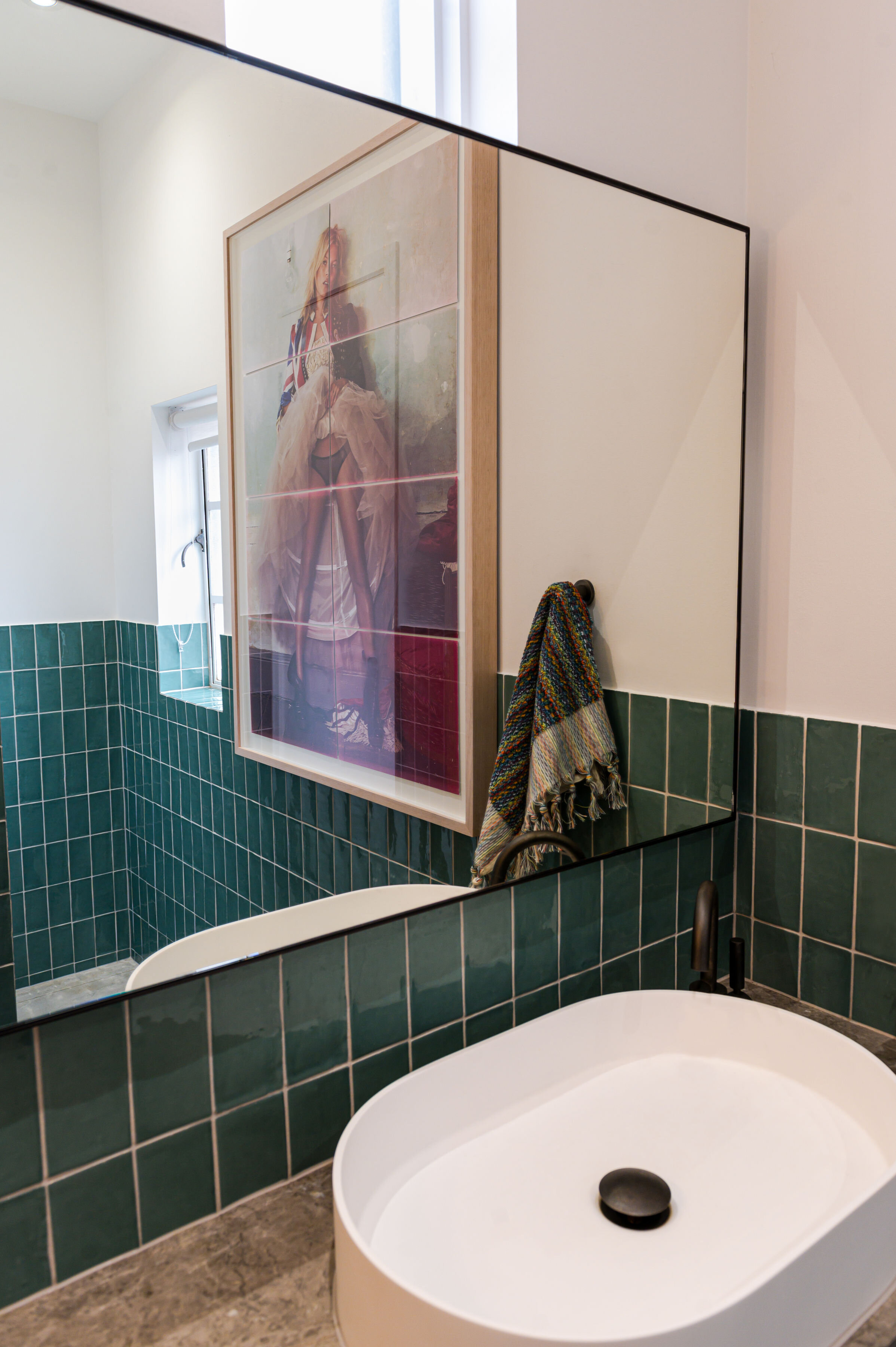
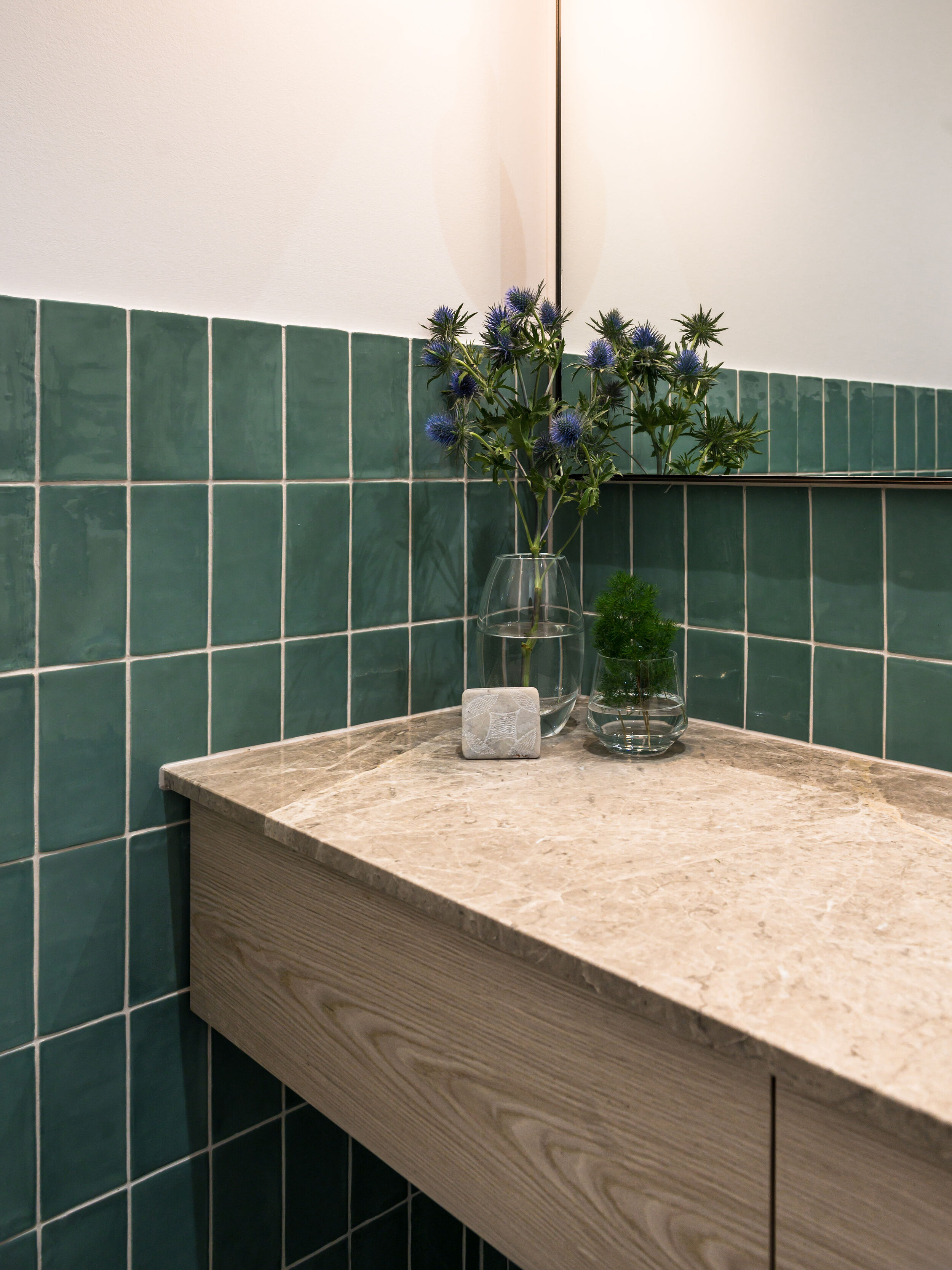
We designed this powder room with the intention of it packing a punch with colour. The rest of the home is neutral & understated, so the client wanted to have fun with this space!
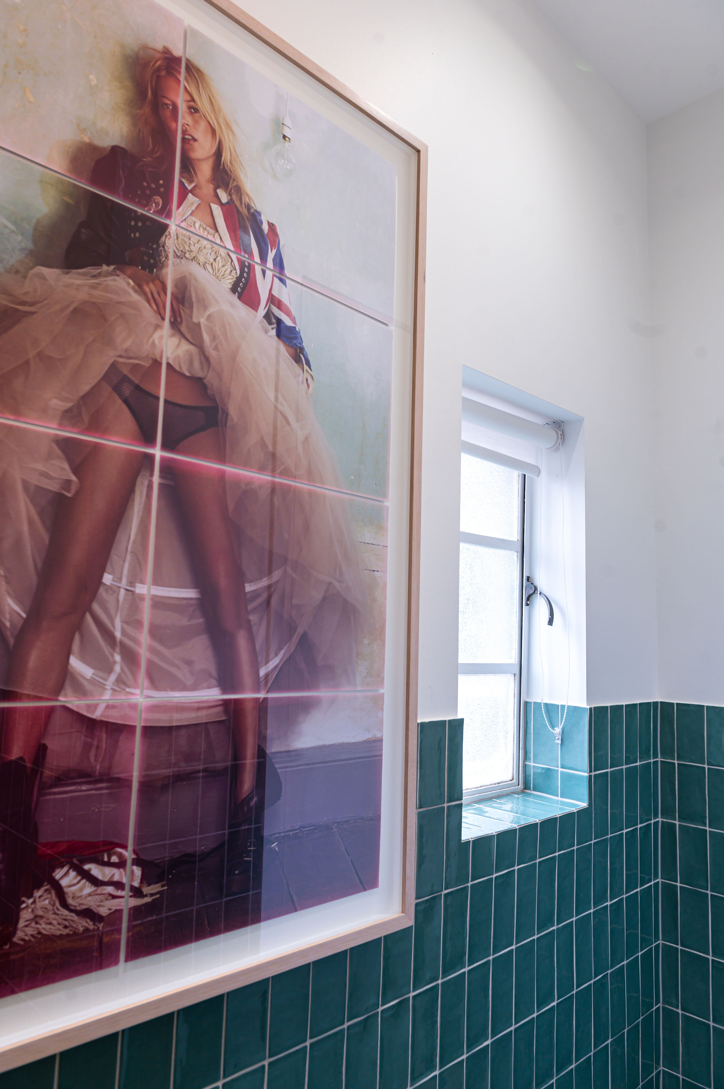
The client’s love of Kate Moss saw an opportunity to design a room around the Mario Testino piece that had been unframed and collecting dust for years, so we got it float-mounted and framed and designed the room around it.
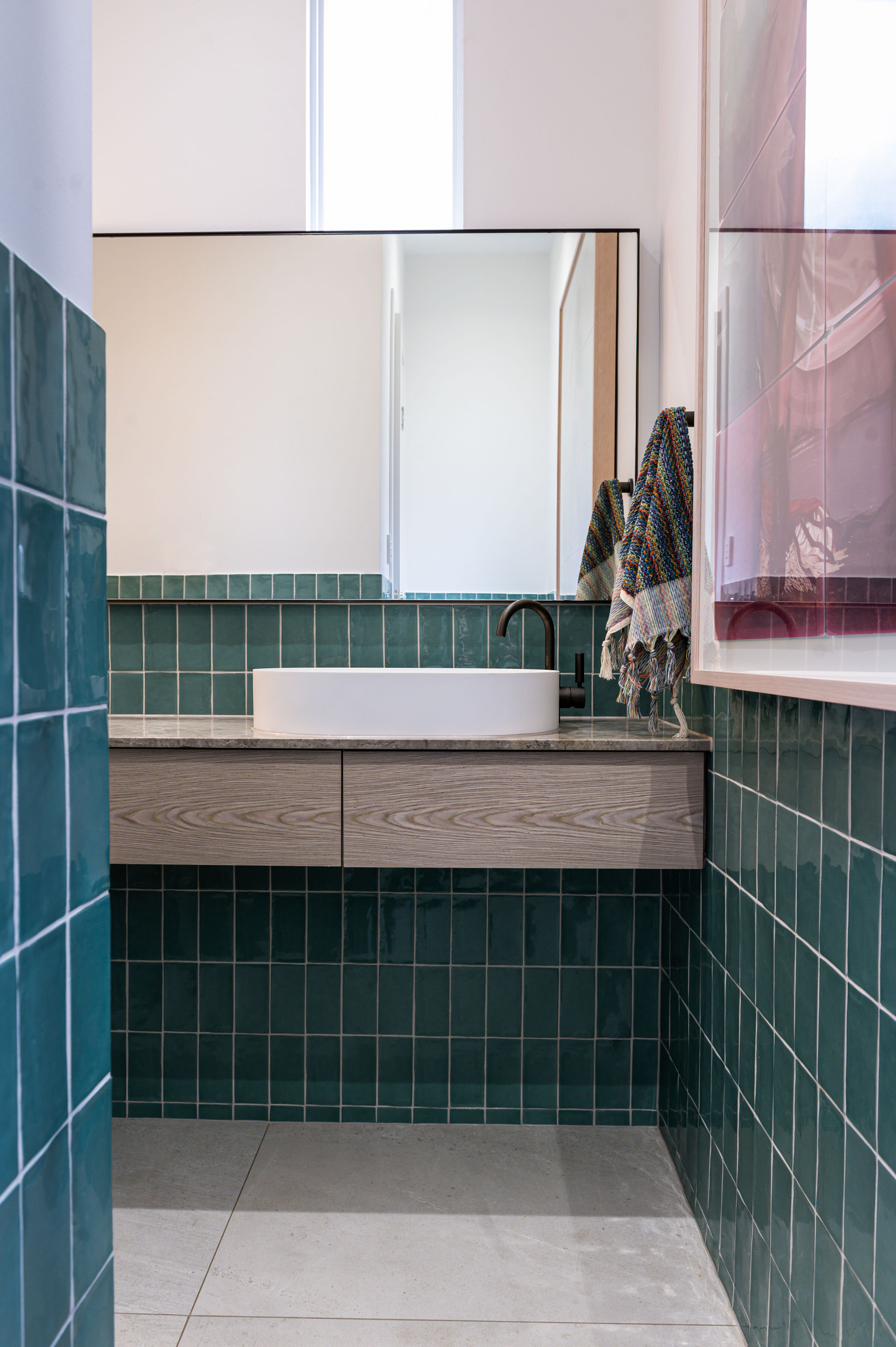
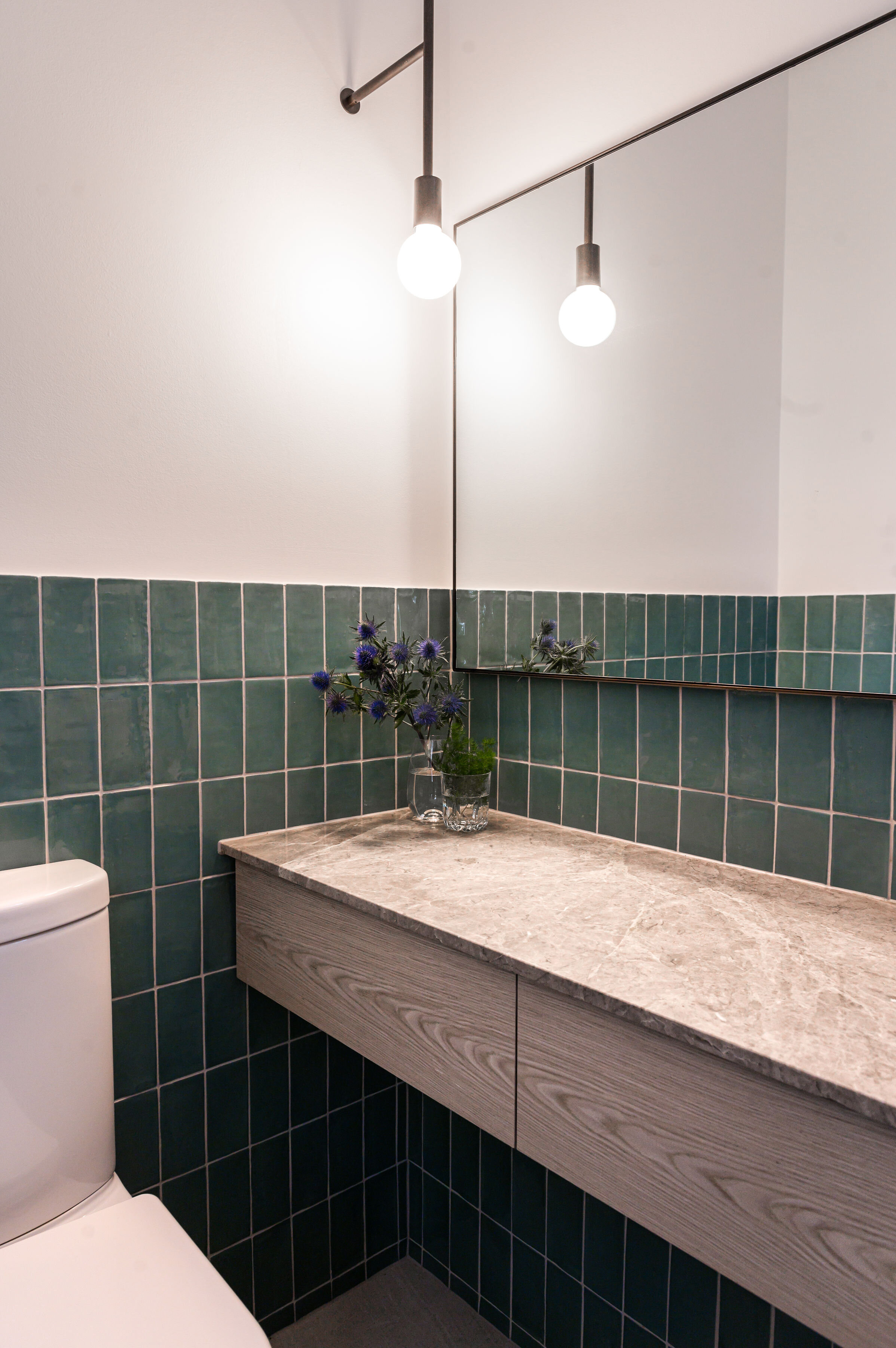
The dark bronze-framed mirror has a look of being hung (as the tiles extend up behind it), so it complements the ‘Gallery’ vibe.
The dark bronze custom Volker Haug light ties in with the dark bronze tapwear & fittings.
The height of the green tiles allowed the room to remain open & feel light, and to allow the tiling detail around the window to be a feature of great craftsmanship.
The floating vanity has a combination of textural stone & a lightly grained timber veneer to bring out the grunge of the artwork.
The details of the horizontal continuous grain and shadow lines on either side help establish the floating look and draw the eye across the room.
Photographer: Hanami Photography
Sam
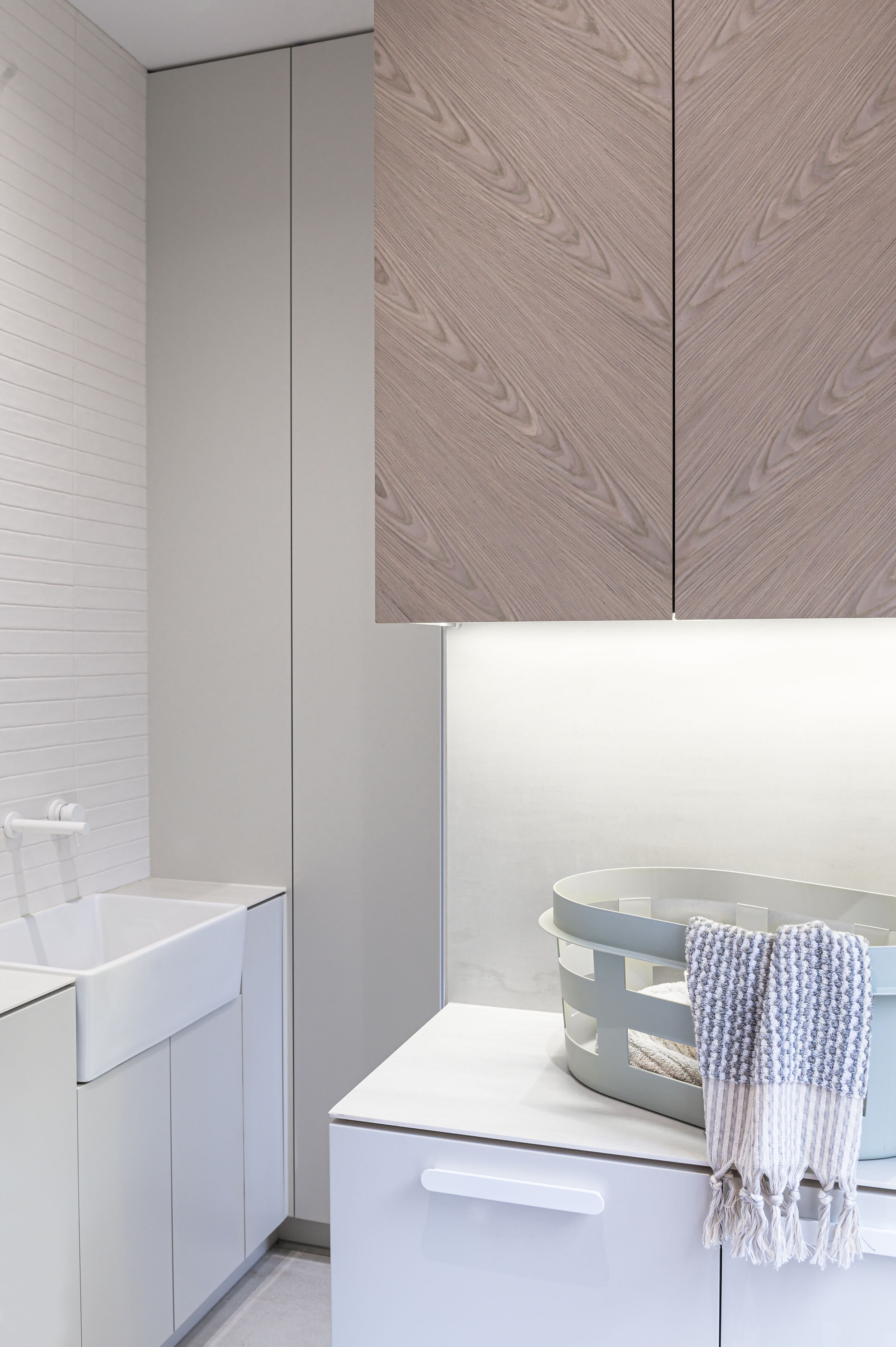
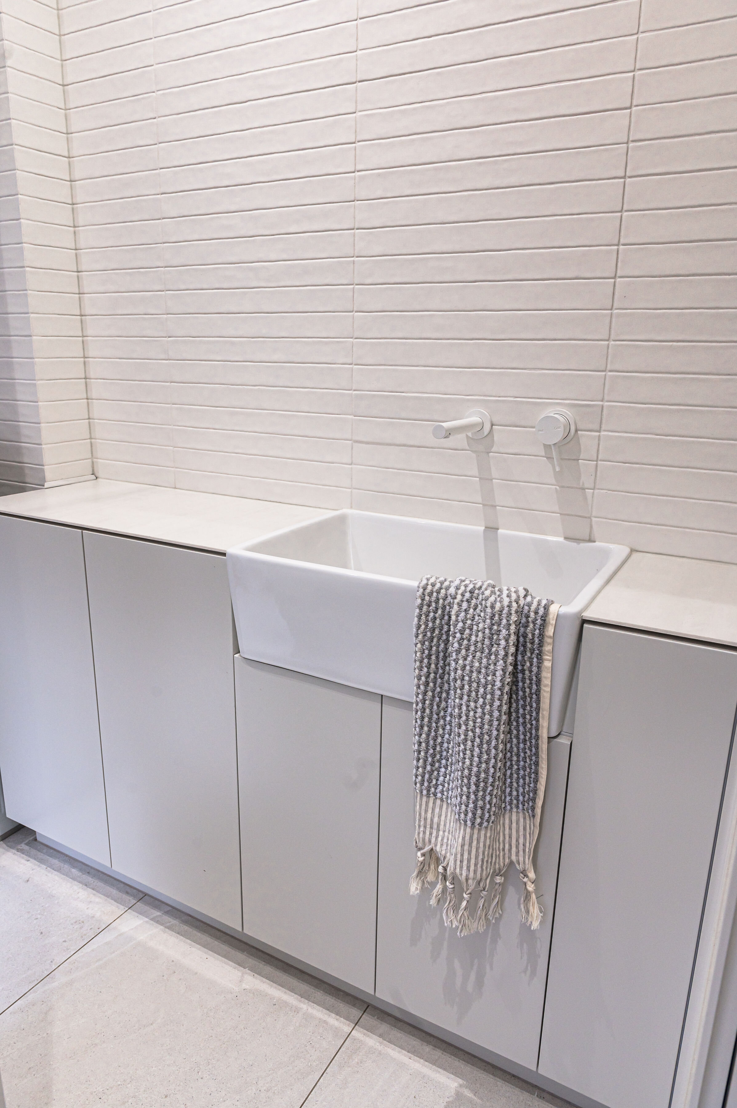
A functional laundry with ample storage (& party potential)
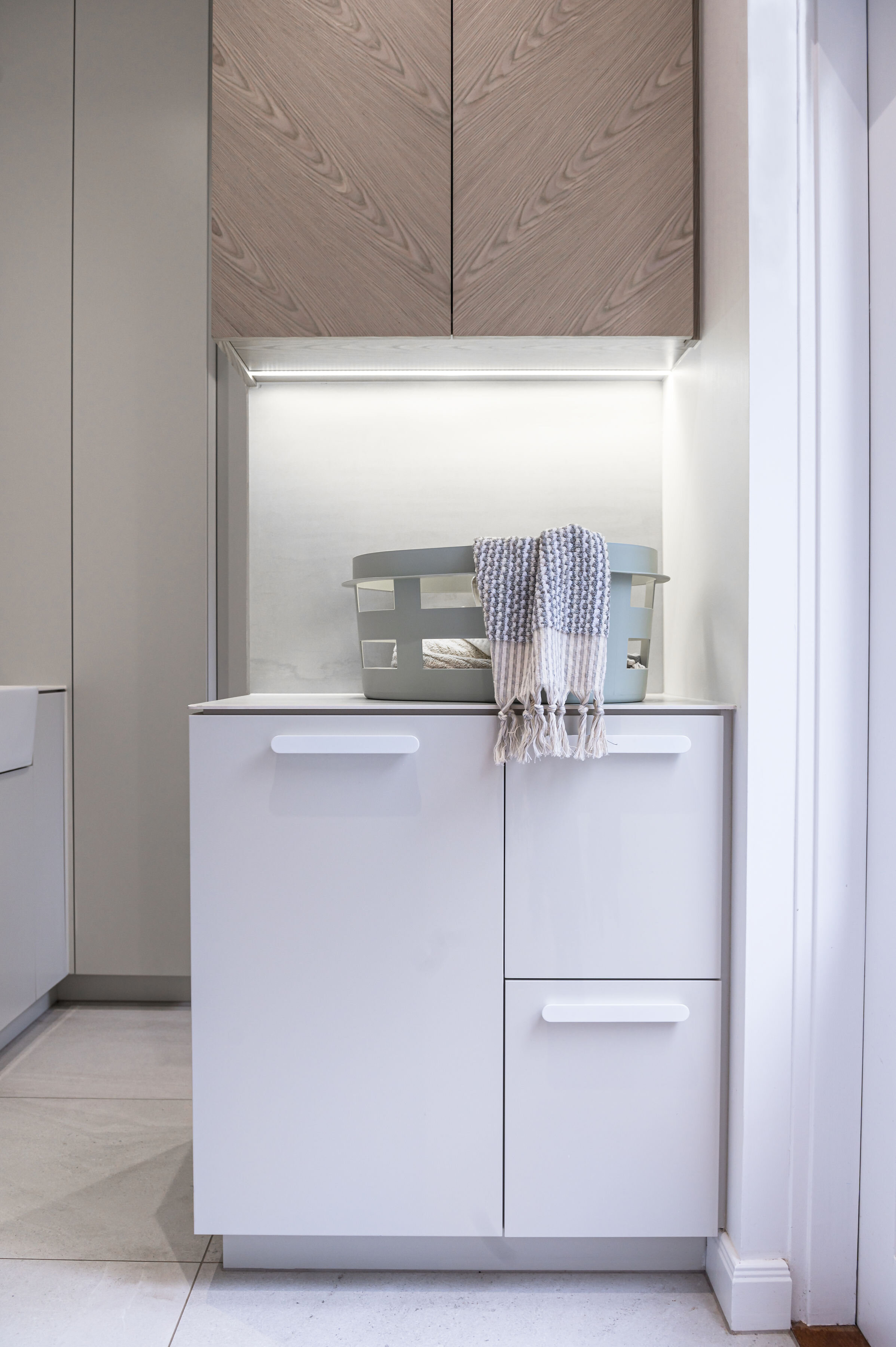
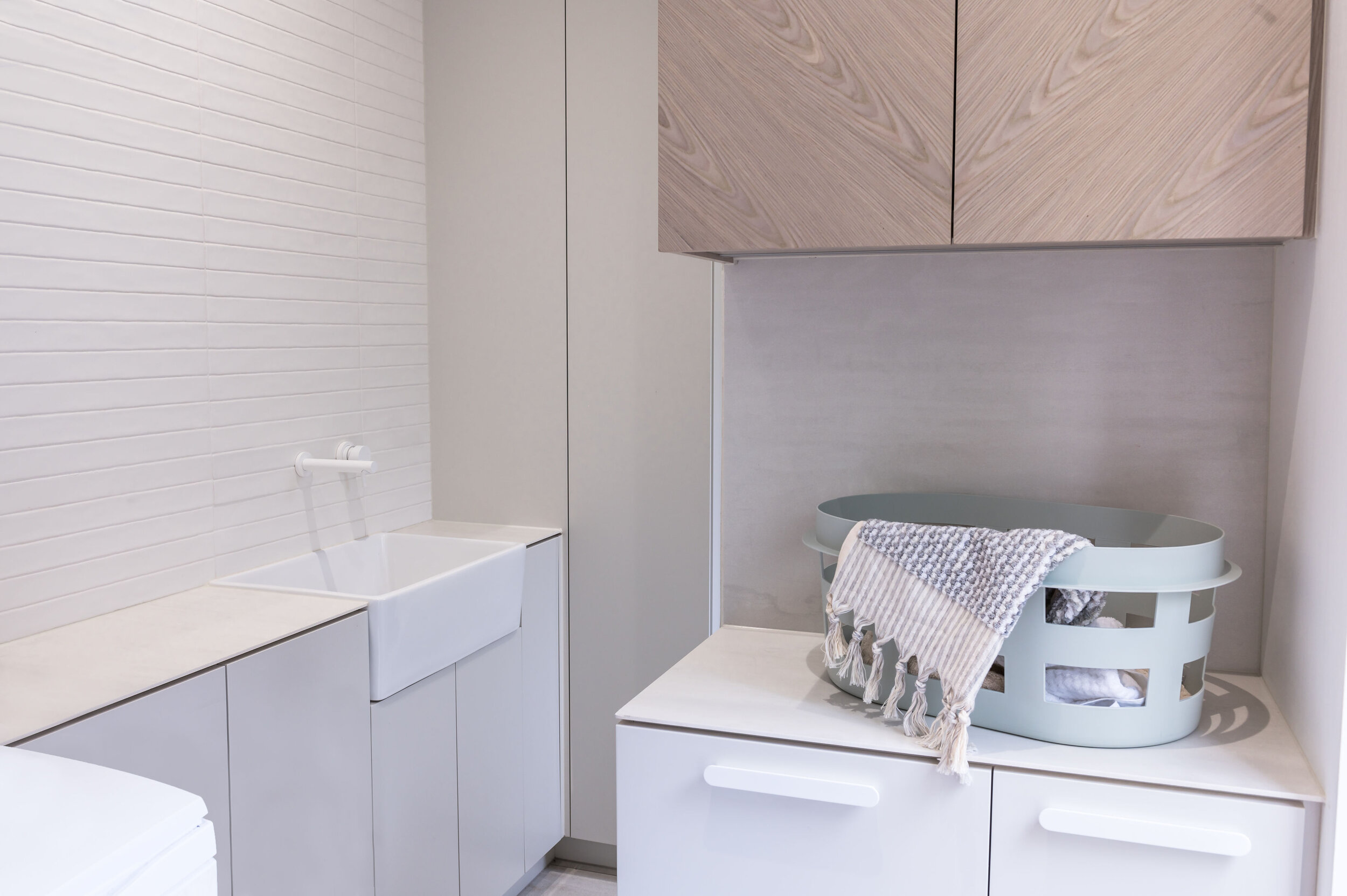
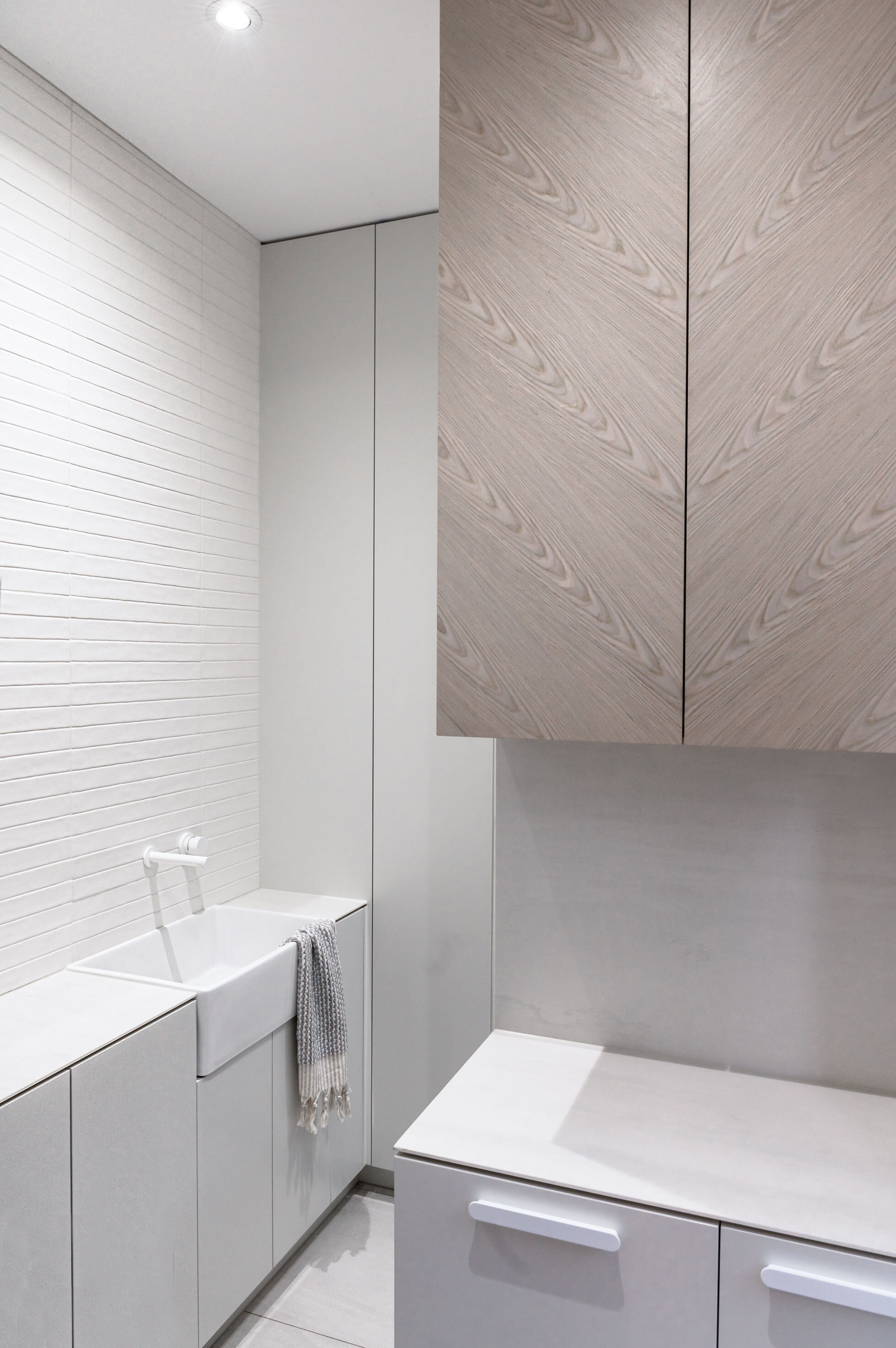
The brief from the client was to create a light, bright, functional laundry for their growing family. They didn’t want boring old stark white (they came to the right practice!) yet they wanted it to be a minimalistic contemporary addition to their home.
We built in a wall to create some dynamic movement and to allow us to run floor-to-ceiling cabinetry along it that houses the vacuum (inc. wall-mounted charging point), ironing board, iron, Christmas decorations, sports gear, medical stuff and all the other bits of bobs that end up swarming into laundry cupboards!
The base cabinets host a myriad of removable laundry baskets, sorting stations & laundry products. The overhead cabinet hosts vases and extra glassware for when they entertain.
As the laundry opens out to both the kitchen & the outdoor entertaining area, this space also doubles as a drinks station for house parties/barbies.
The cabinetry unit facing the main door is the perfect place to pour a champagne, after grabbing it from ‘the ice bucket’ (ceramic laundry trough filled with ice) before rejoining the party.
The compressed porcelain panel used for the benchtop gives a
sleek profile, whilst not compromising on durability.
The low-contrast timber veneer complements the texture of the handmade ceramic tiled splashback
Photographer: Hanami Photography
Gerard
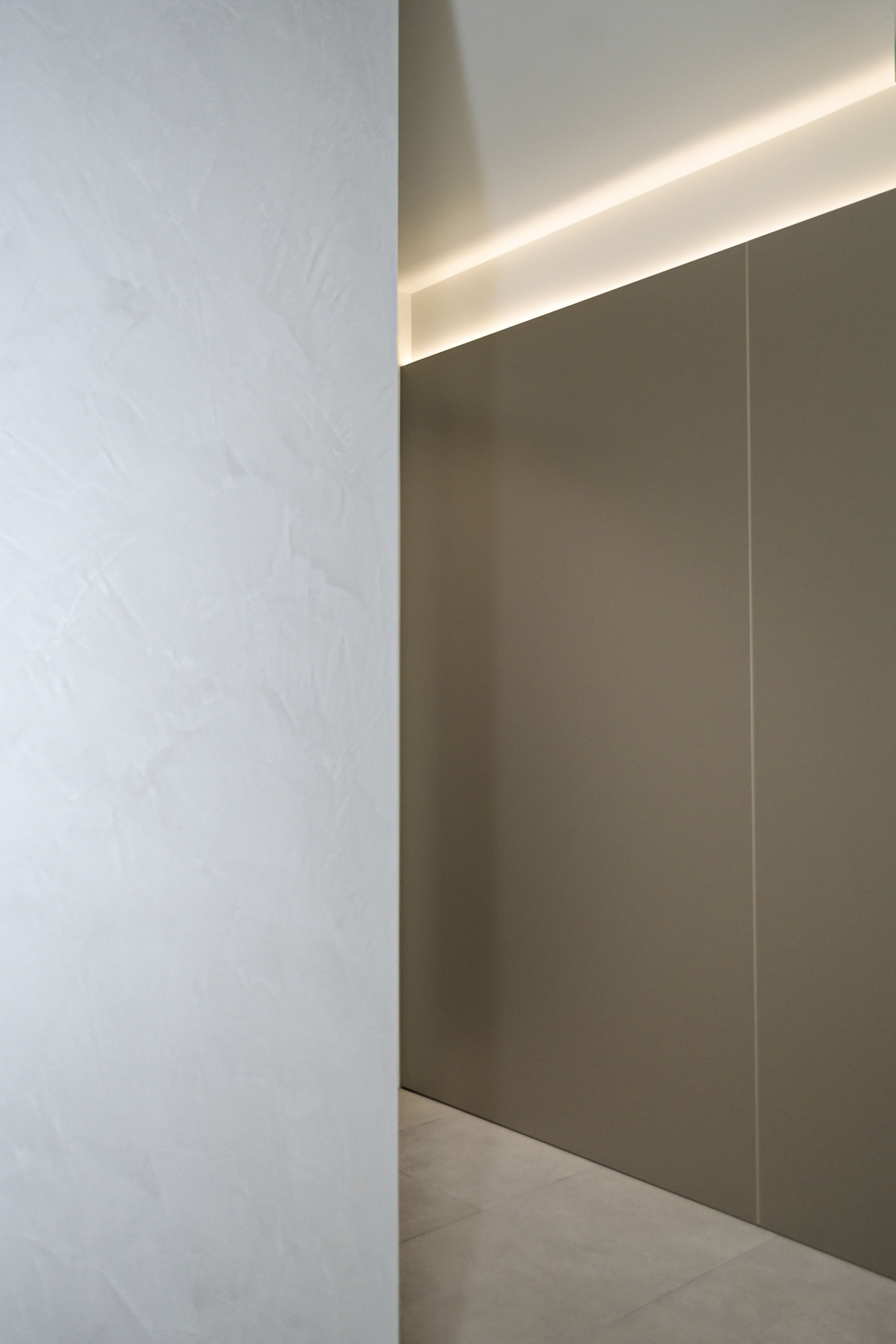
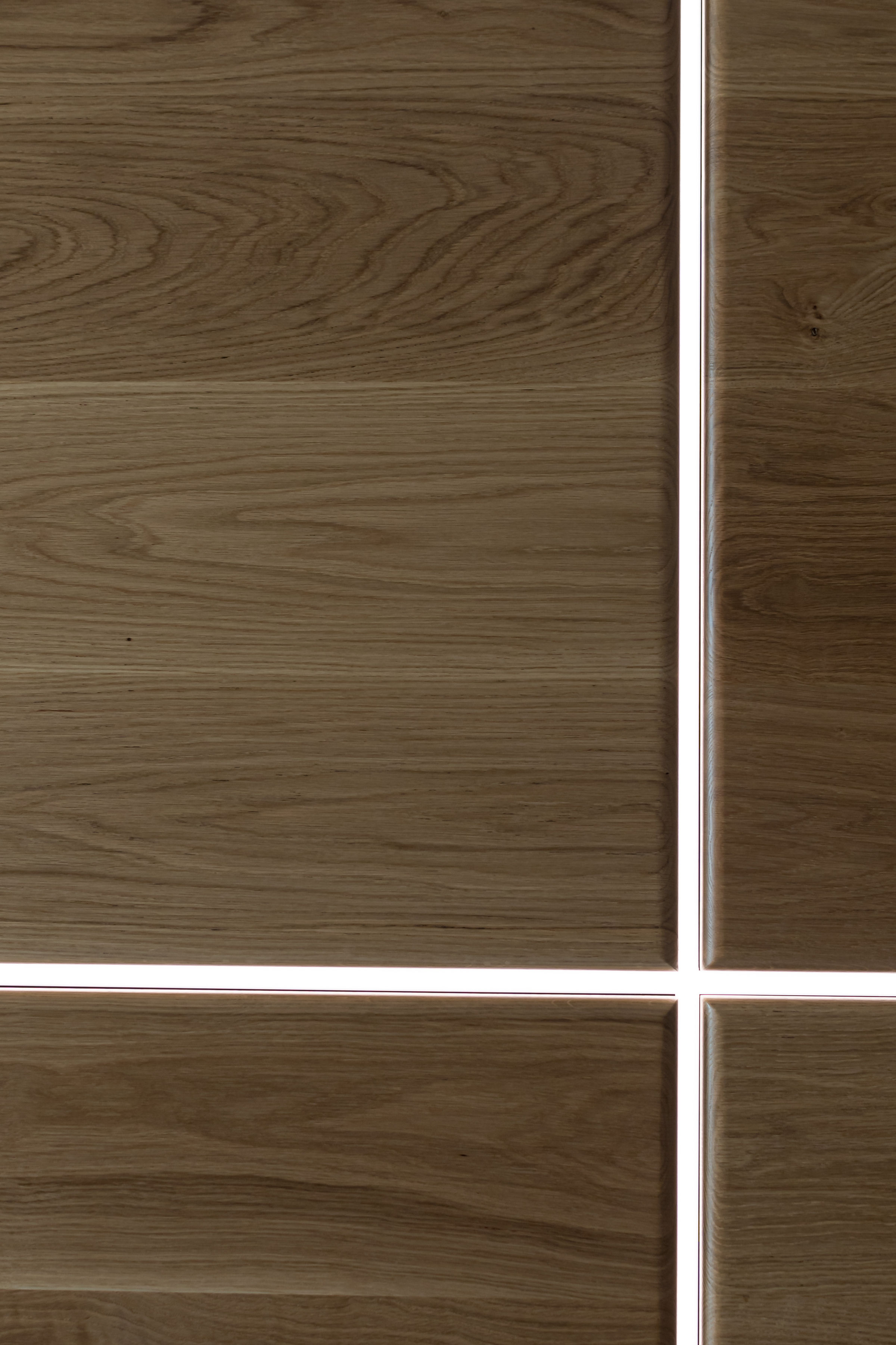
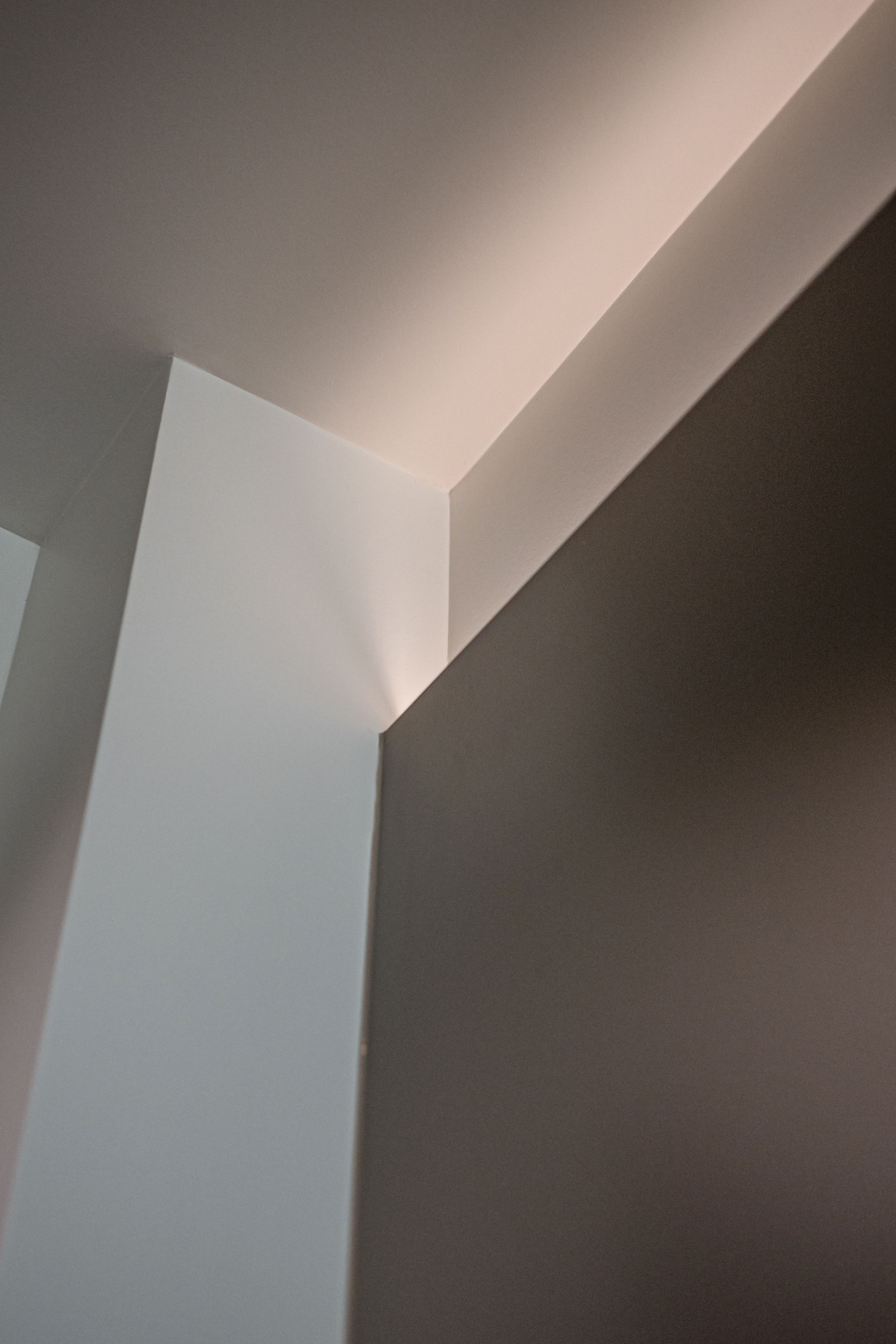
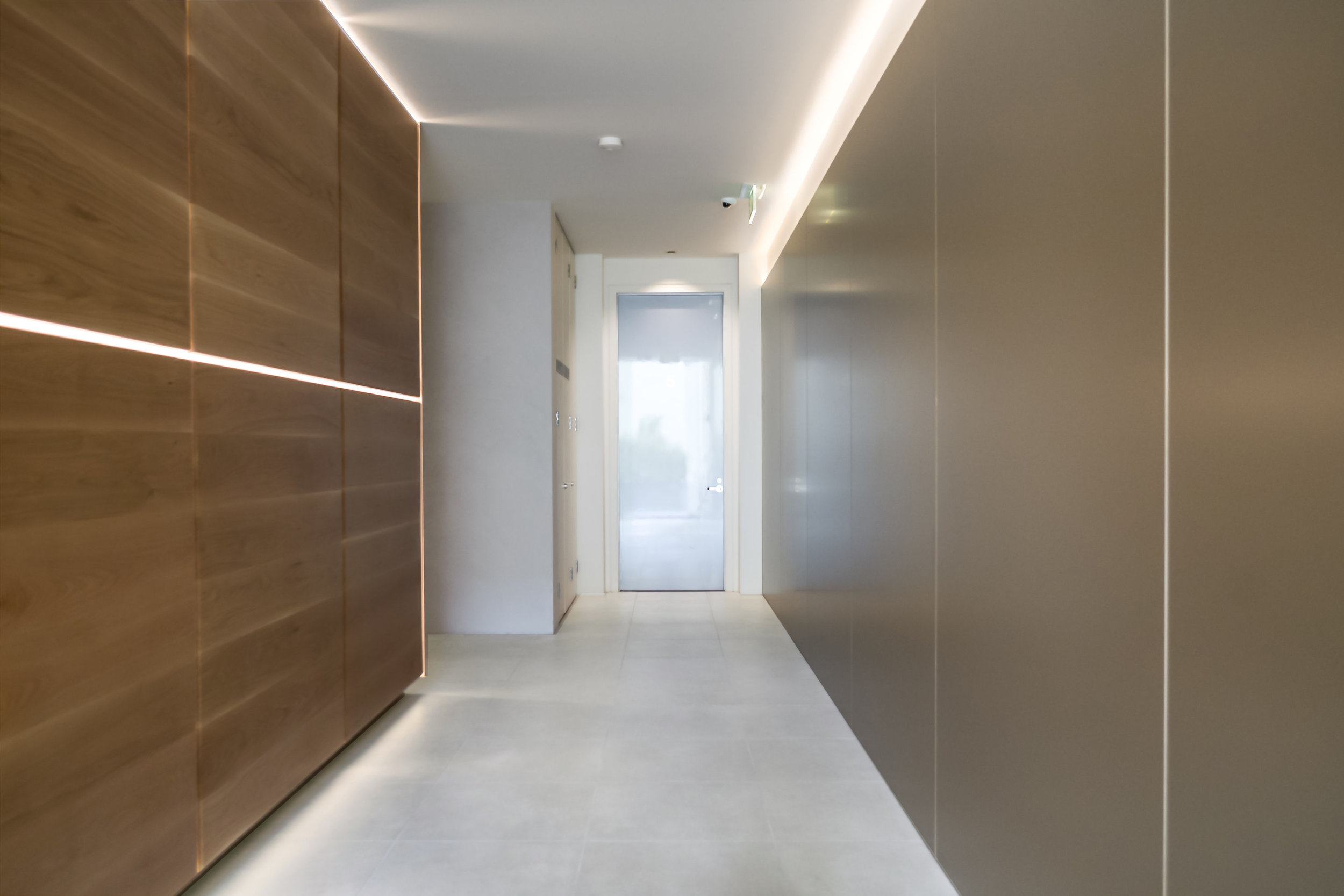
An architectural response to a contemporary multi-residential foyer in South Yarra.
Designing a new foyer for an apartment complex that everyone loved is a
tricky brief! Due to differing personal opinions, we avoided choosing and
painting the walls punchy colours…instead, we decided to keep our design
response as architectural & to create beautiful moments with the design
details.
Considering the apartment building itself is a contemporary design style,
with the original architect being known for his crisp, clean, masculine
design style, it was only fitting we emulated that on the small scale.
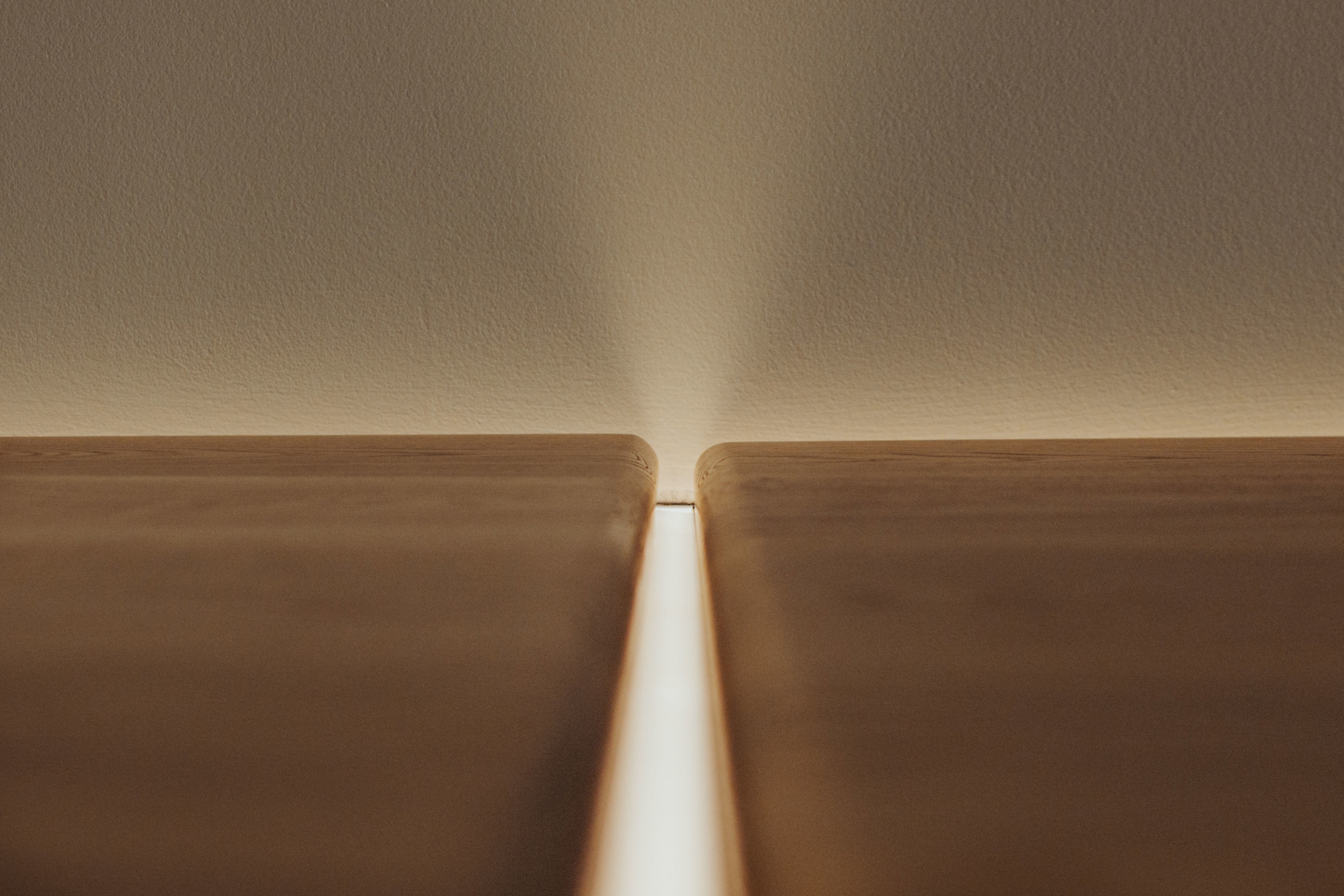
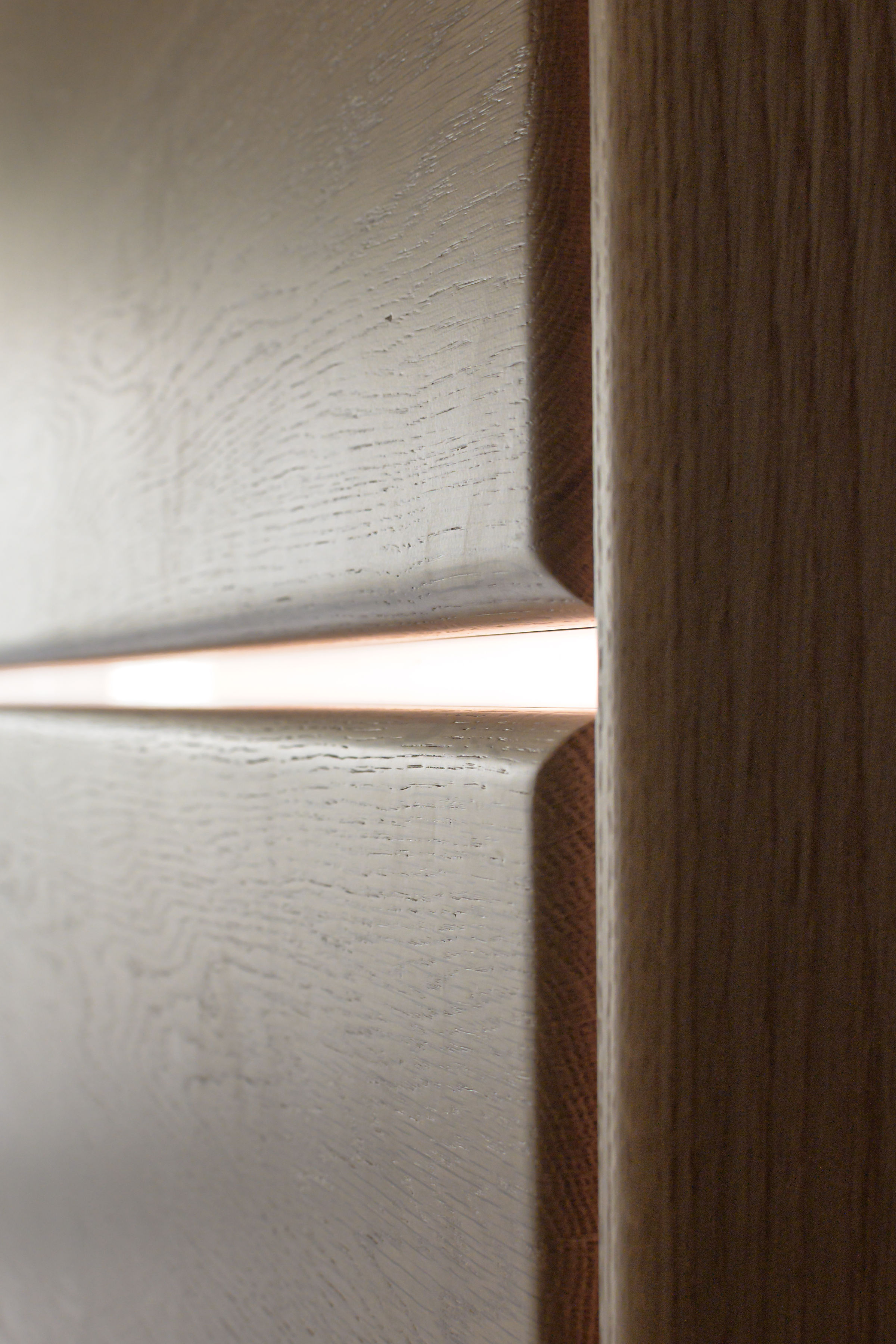
We had one feature wall that had back-lit large panels made out of solid
American oak, and designed the opposing wall to be clad in champagne
metallic pre-fab panels.
We selected floor tiles that had a soft, swirled stone effect, as that
complimented the marmorino (crushed marble) rendered wall that wrapped
around the lift.
The pared-back design meant that the precise horizon lines were perfectly
aligned, and the LED backlighting created an impact where it was necessary.
The play of light, shadow, texture & finish was the main objective.
Photographer: Hanami Photography
James
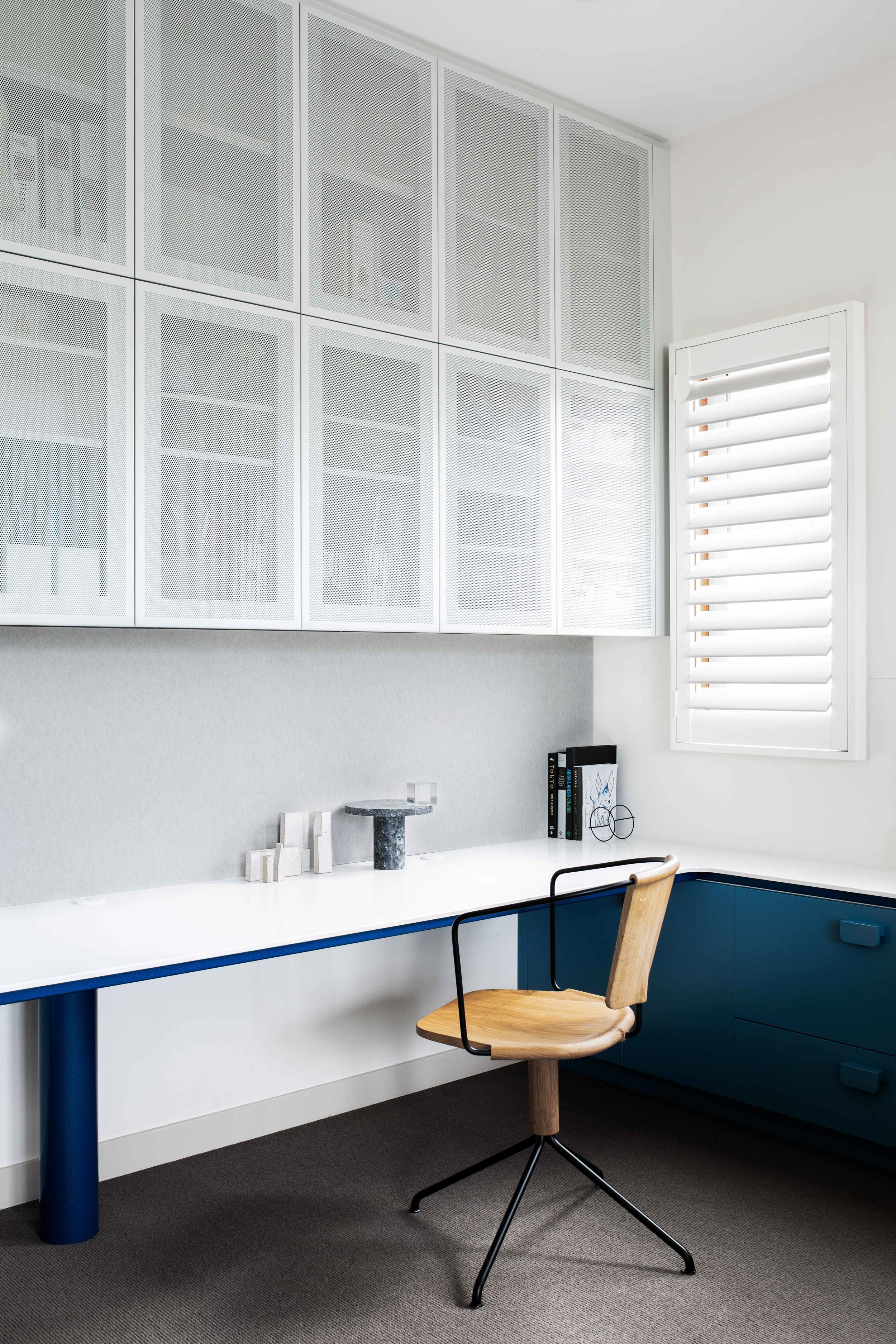
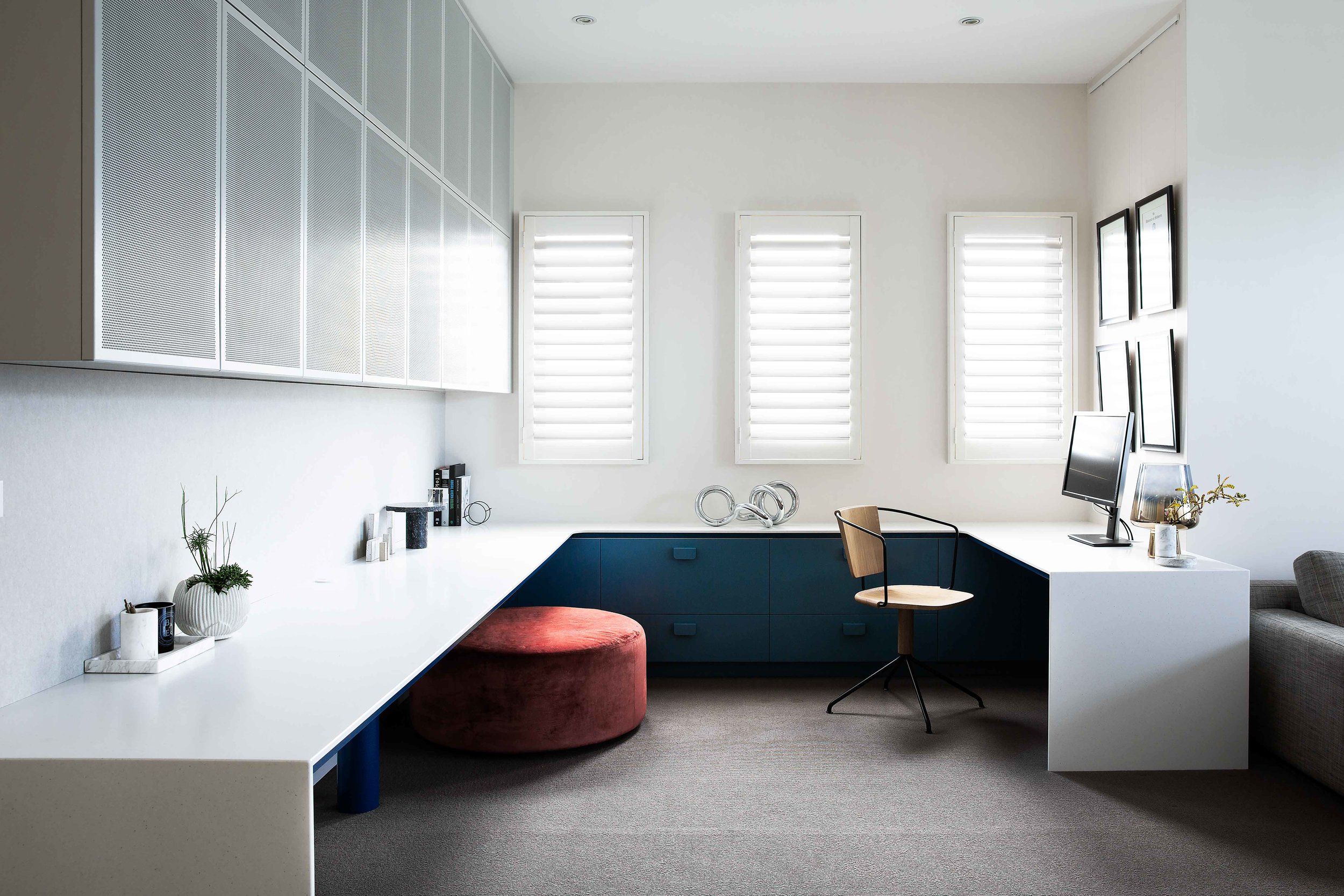
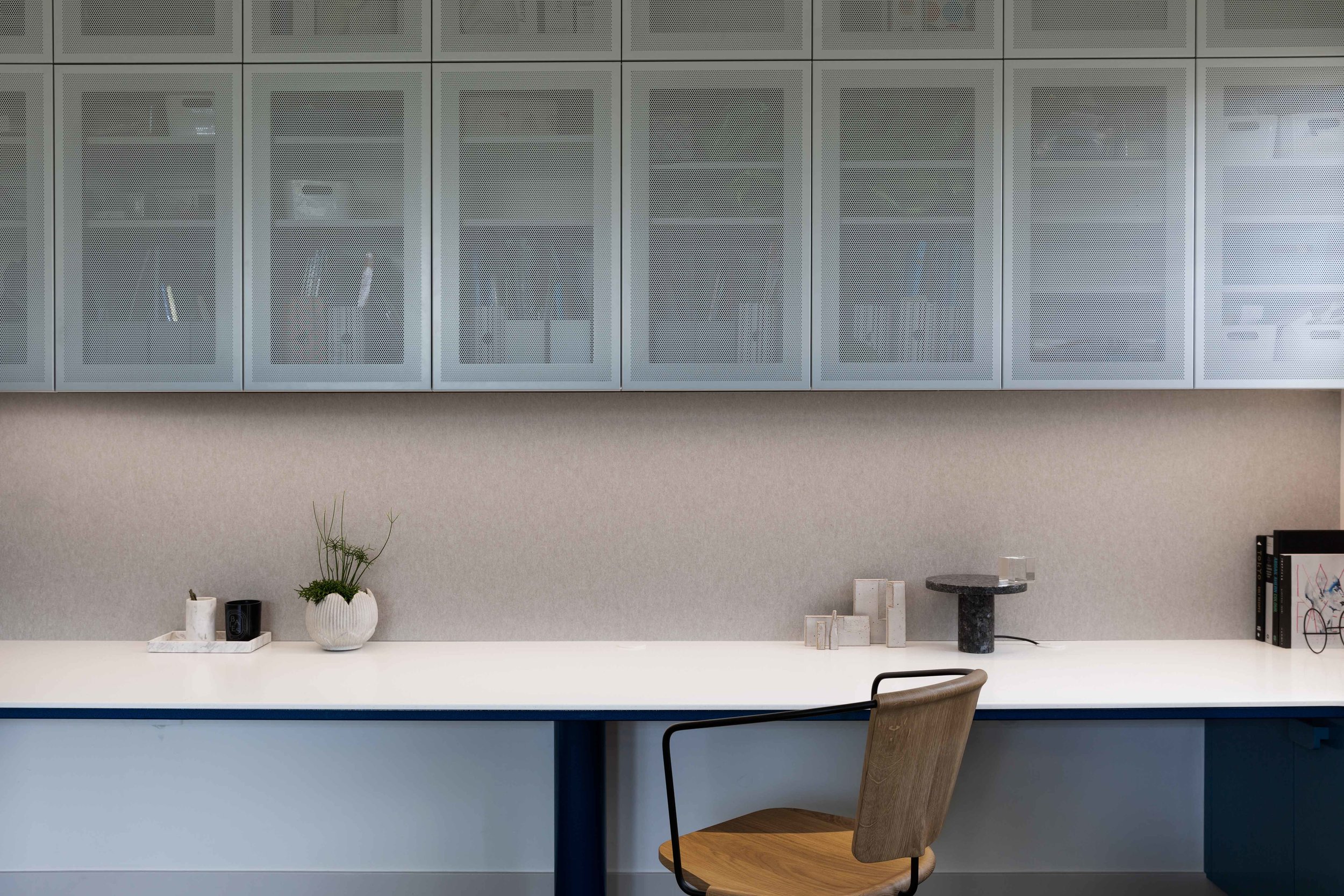
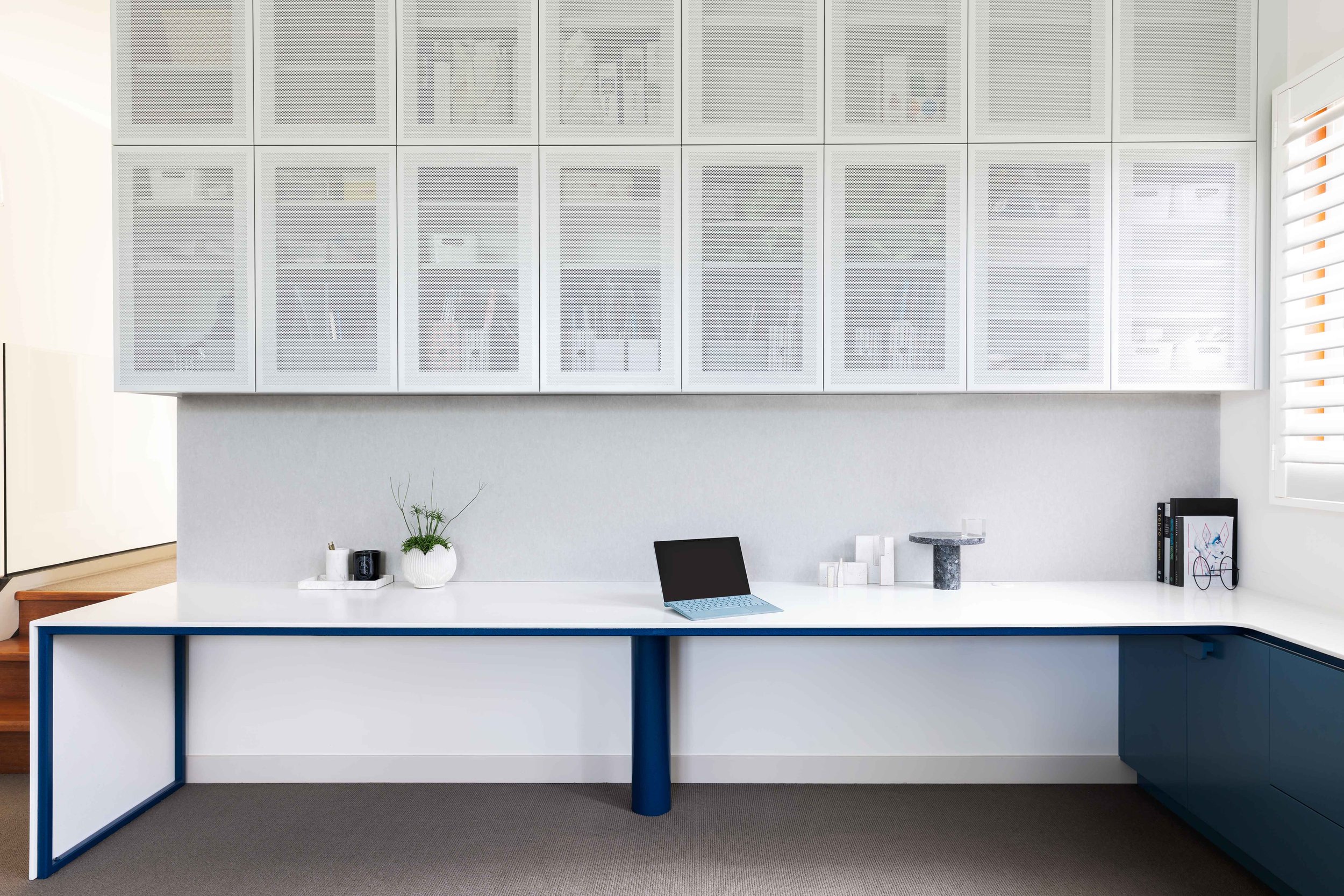
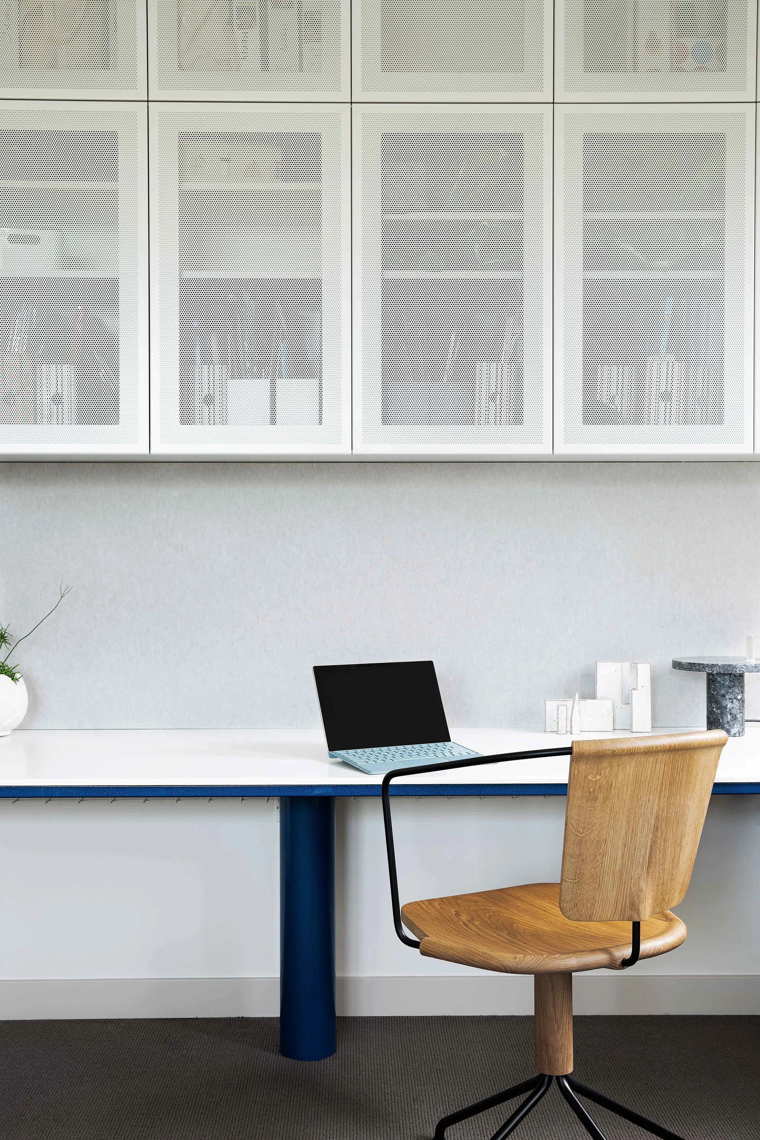
A colourful and functional study space for a young family.
This family needed a functional and tidy study space to suit their busy lives.
Previously, a poorly used space in an open-plan rumpus area, we were
conscious to create a visually appealing addition with unique and refined
details, and not a boring (and uninspiring) ‘home office’.
The result is a truly functional space with a seamless bench top that curves
around the room, enabling the whole family (parents and two children) to
work at the same time.
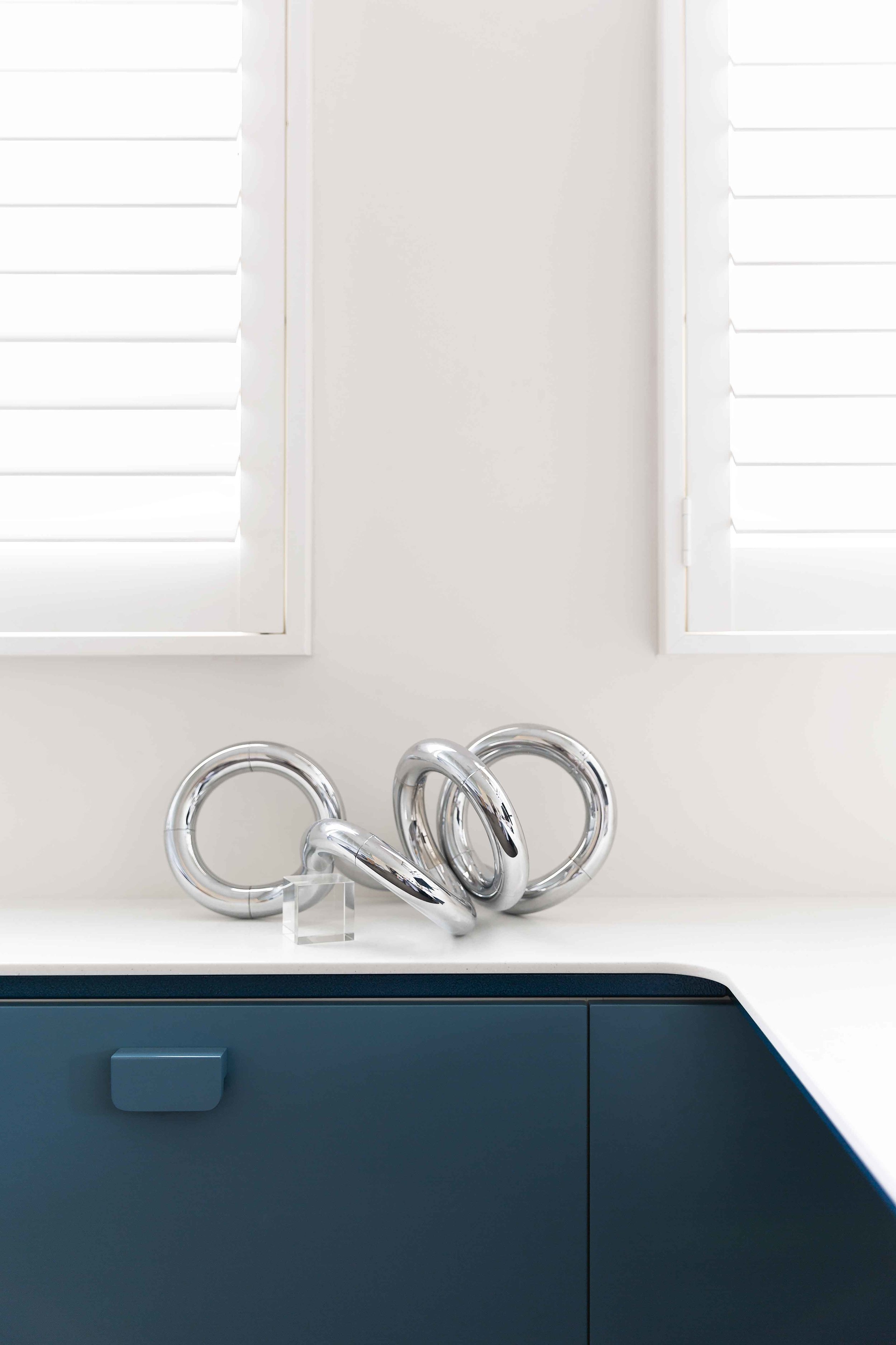
An electric blue hammer finish around the base of the desks shimmers in
different lights, and the underdesk blue cabinets are functional (housing printers/scanners/chargers, etc) while also lifting the space far away from
‘boring home office’.
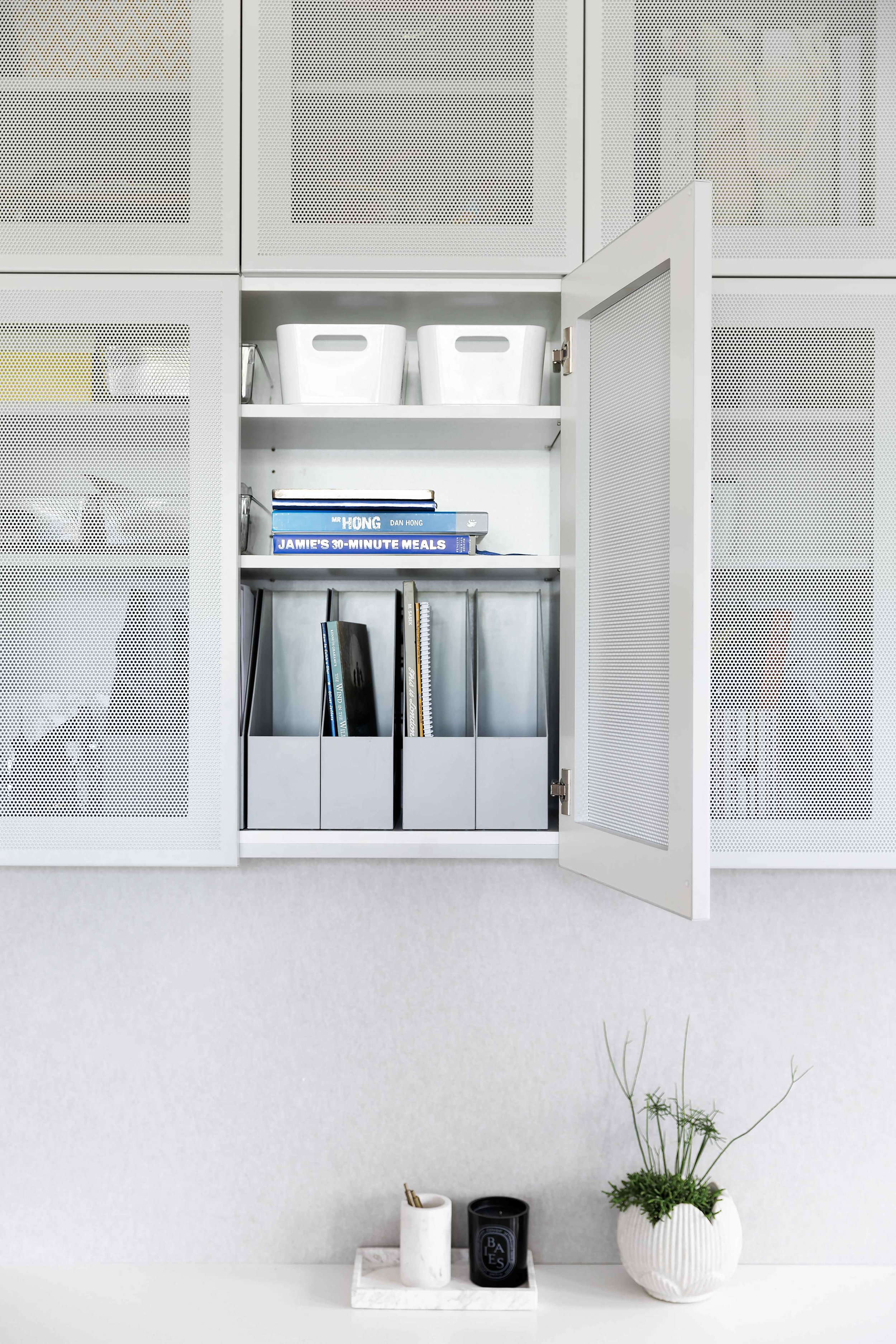
The perforated overhead cabinets afford great storage, and the custom
pinboard stretches from wall to wall, helping to absorb the sounds and
provide ample room for family organisation.
Photographer: Courtney King
Riley
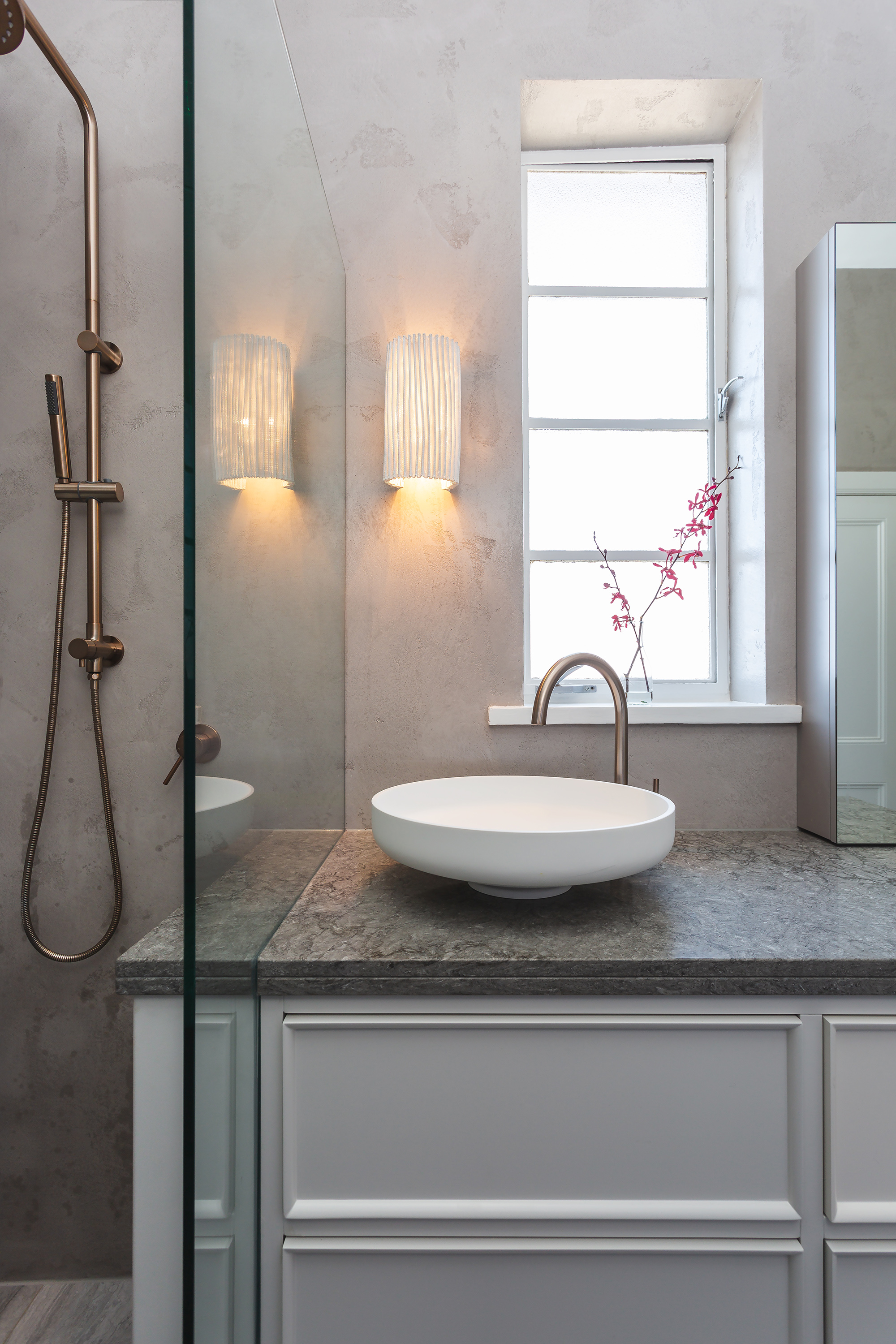
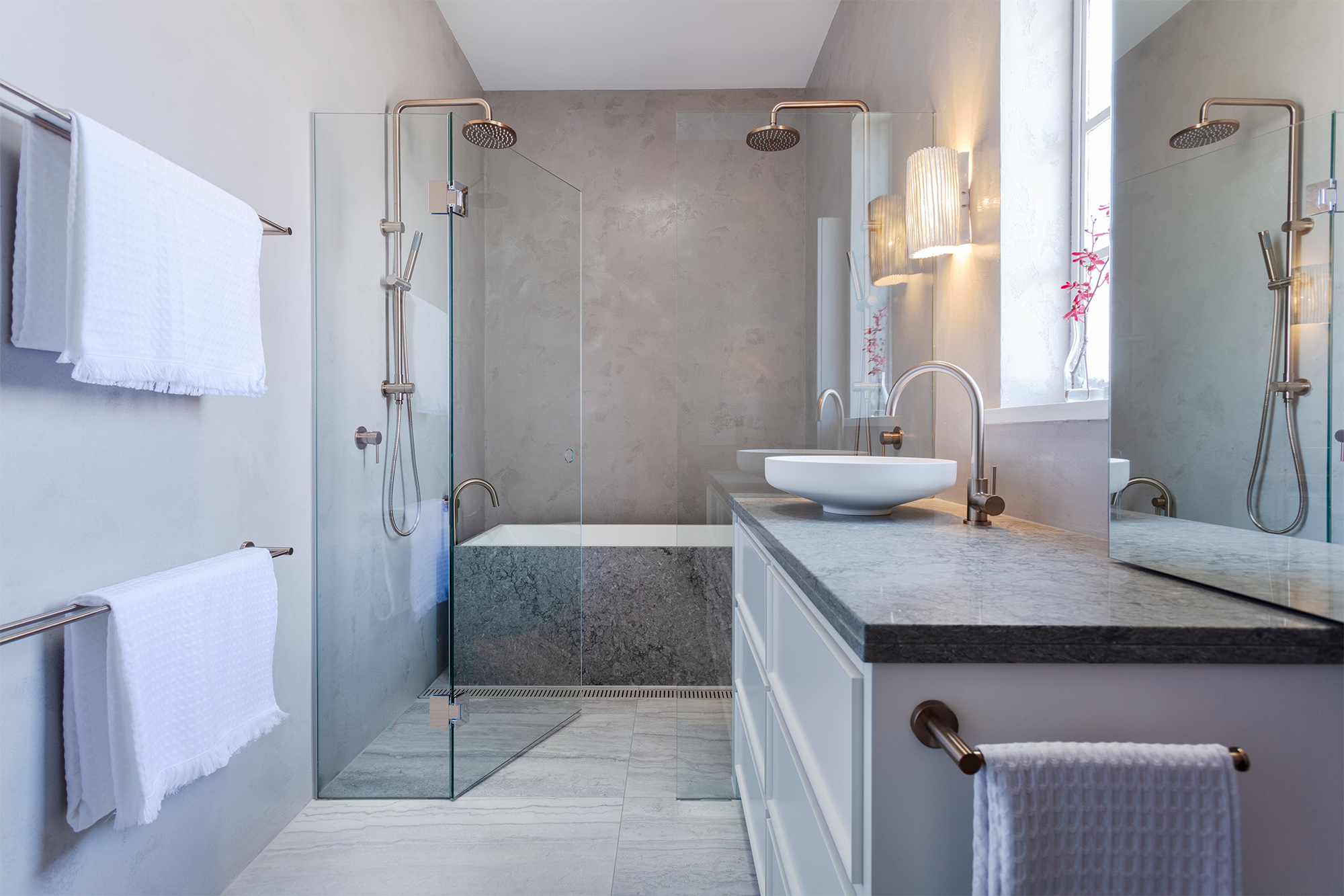
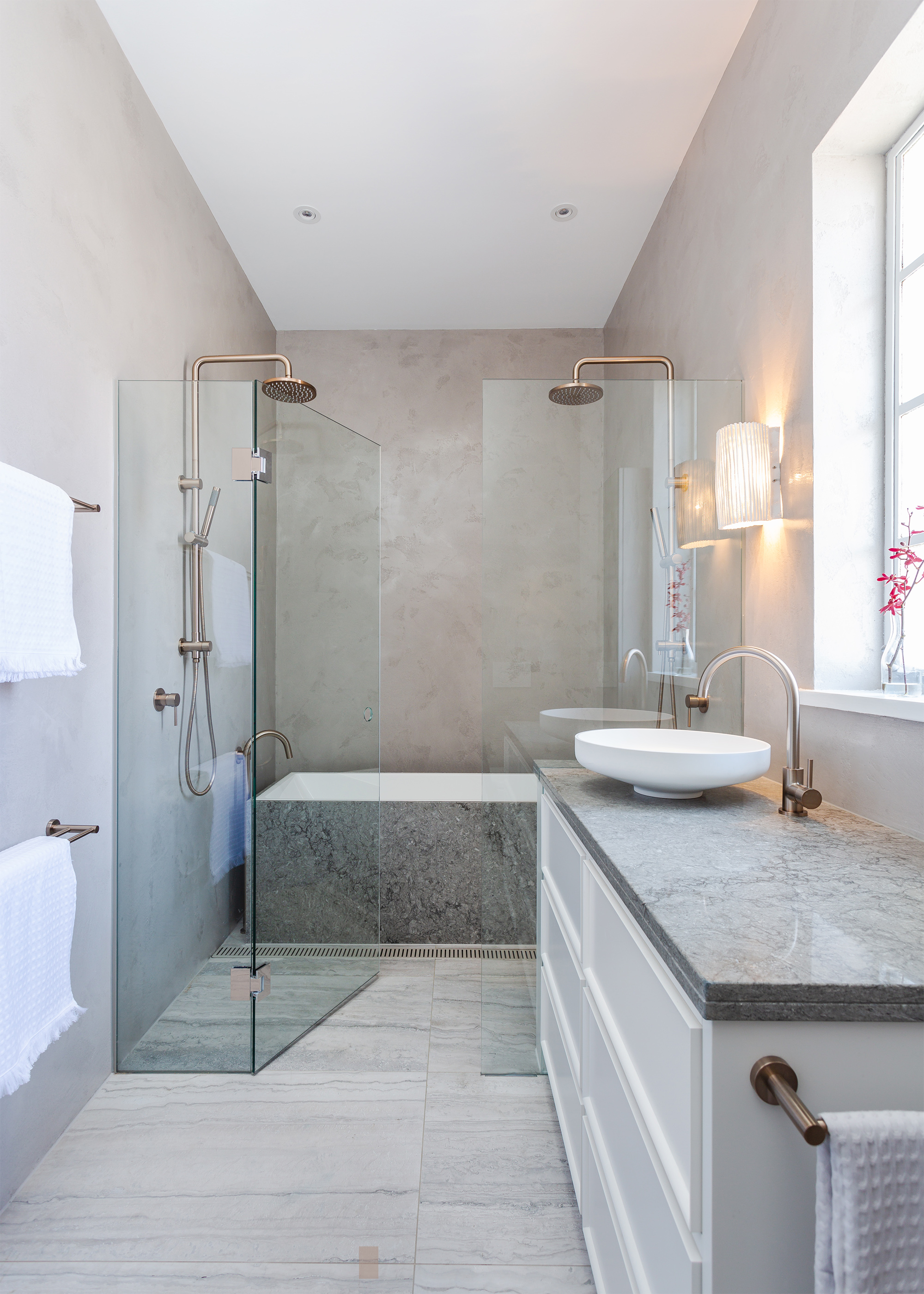
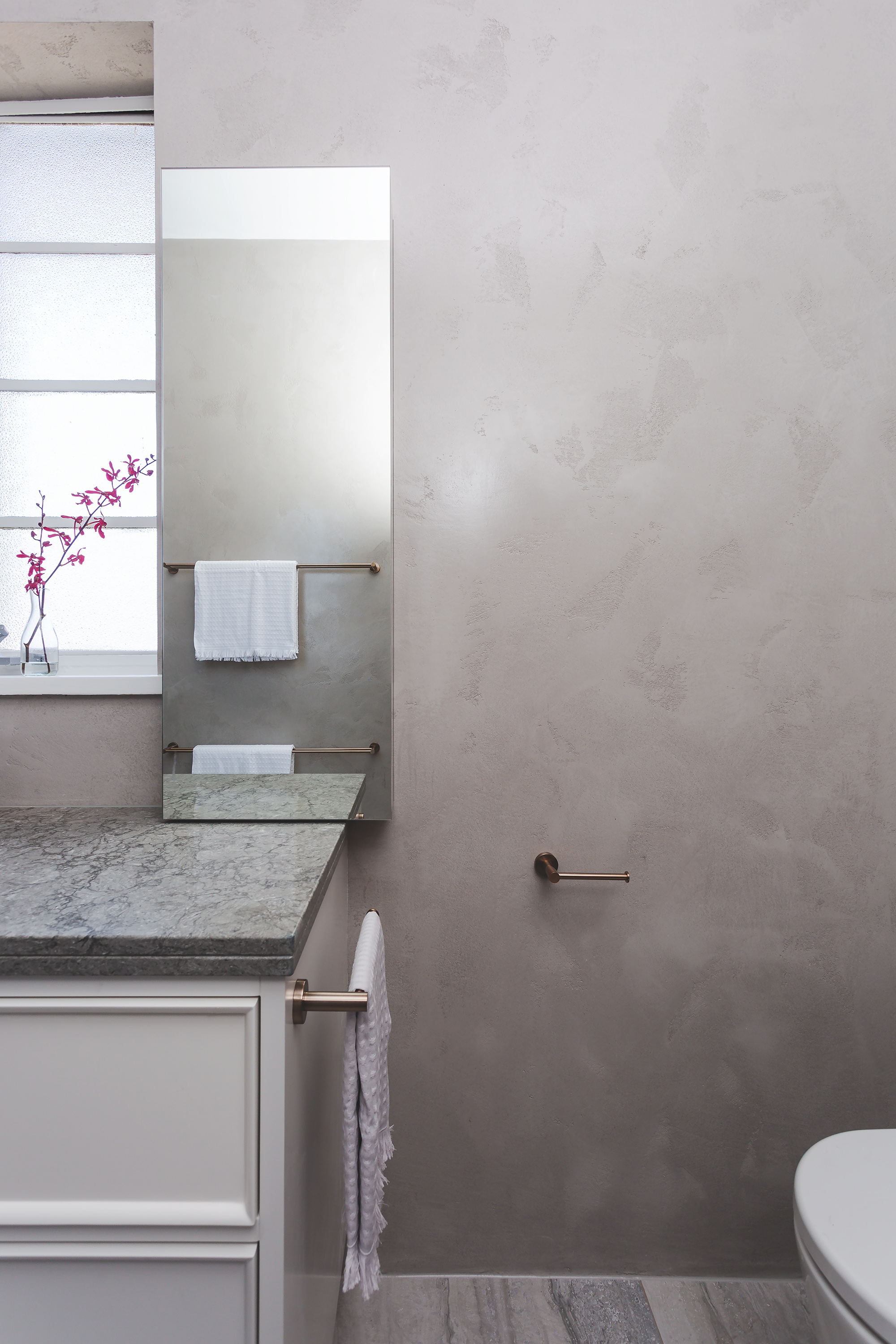
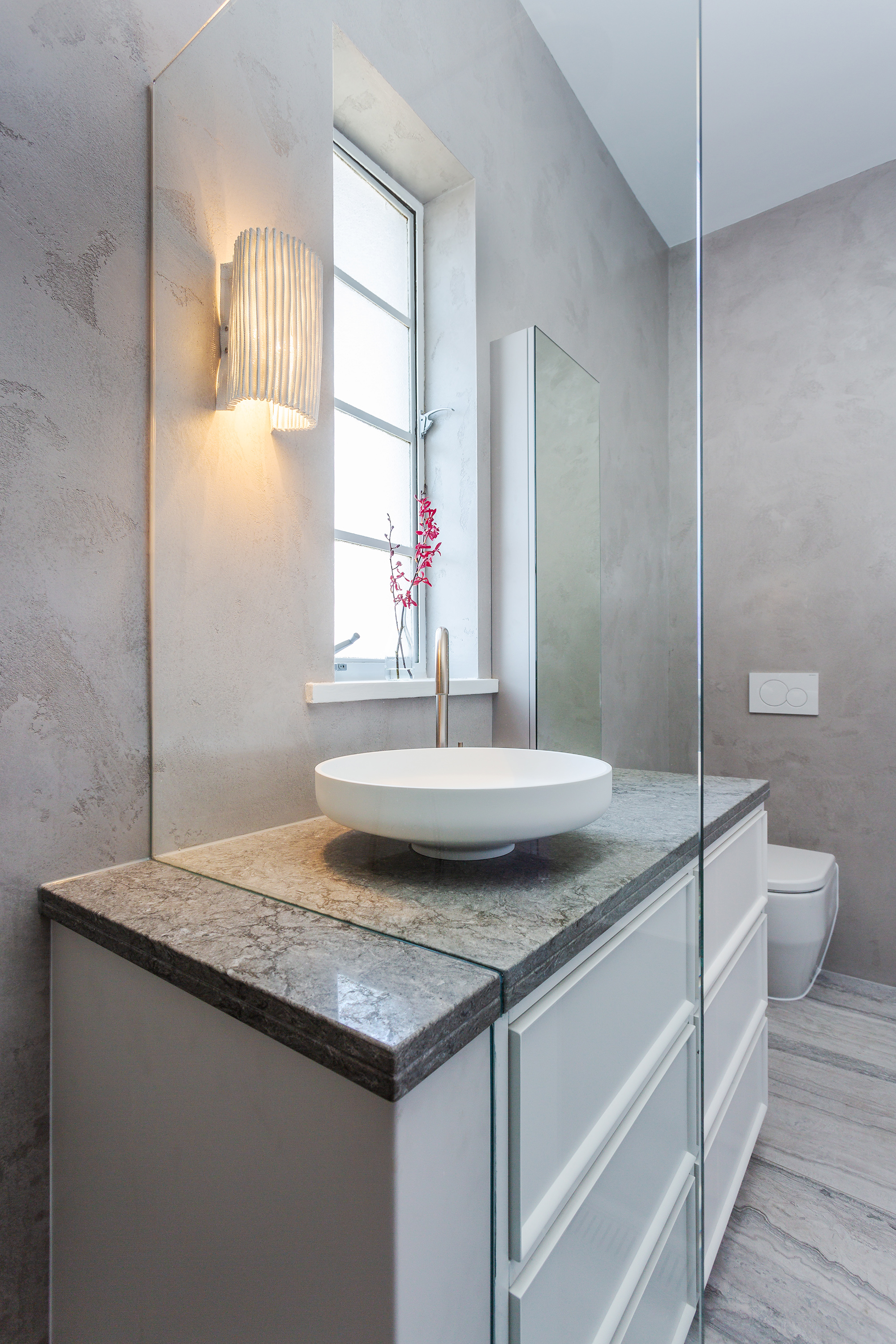
Texture and tone for this Kew family bathroom.
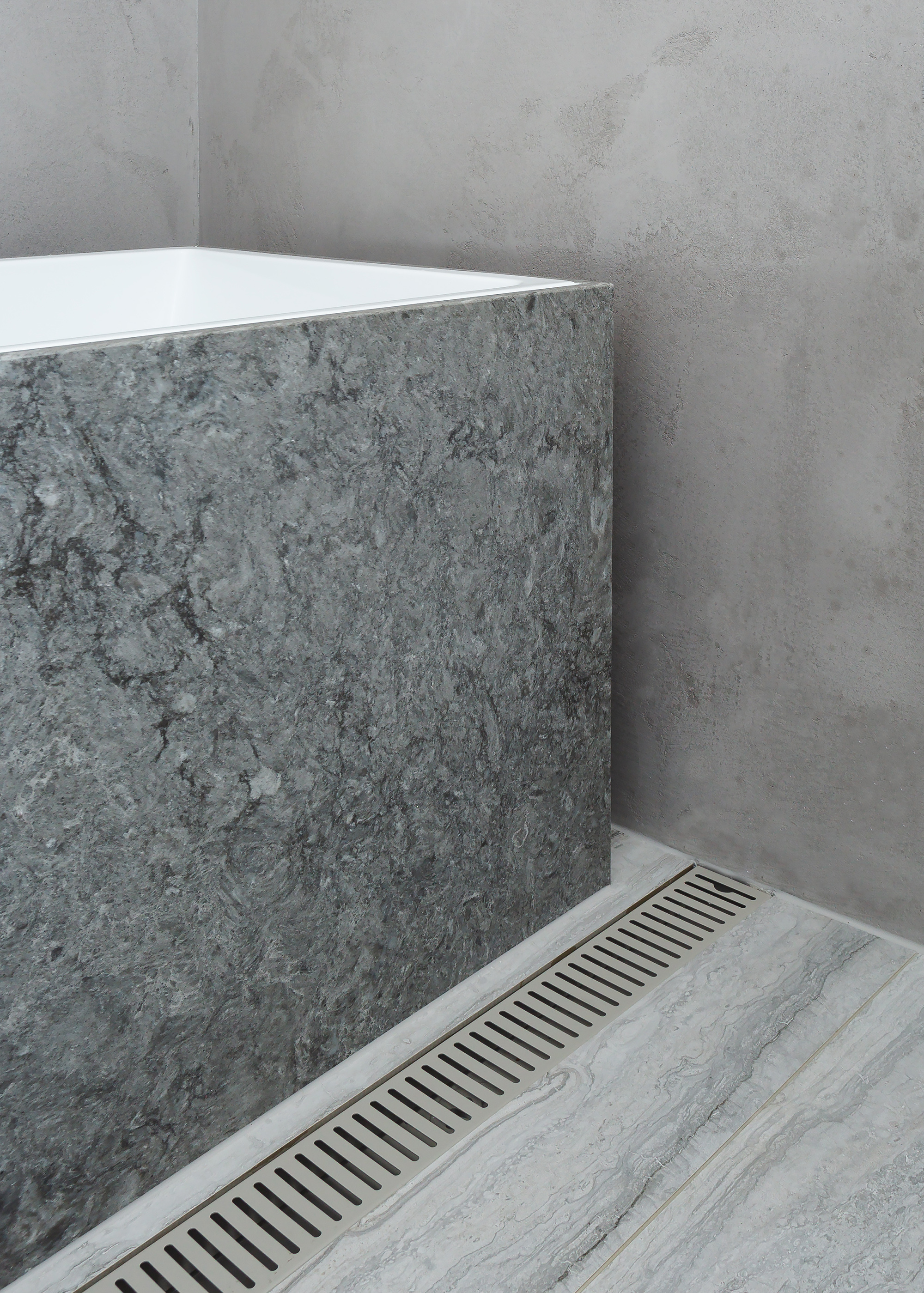
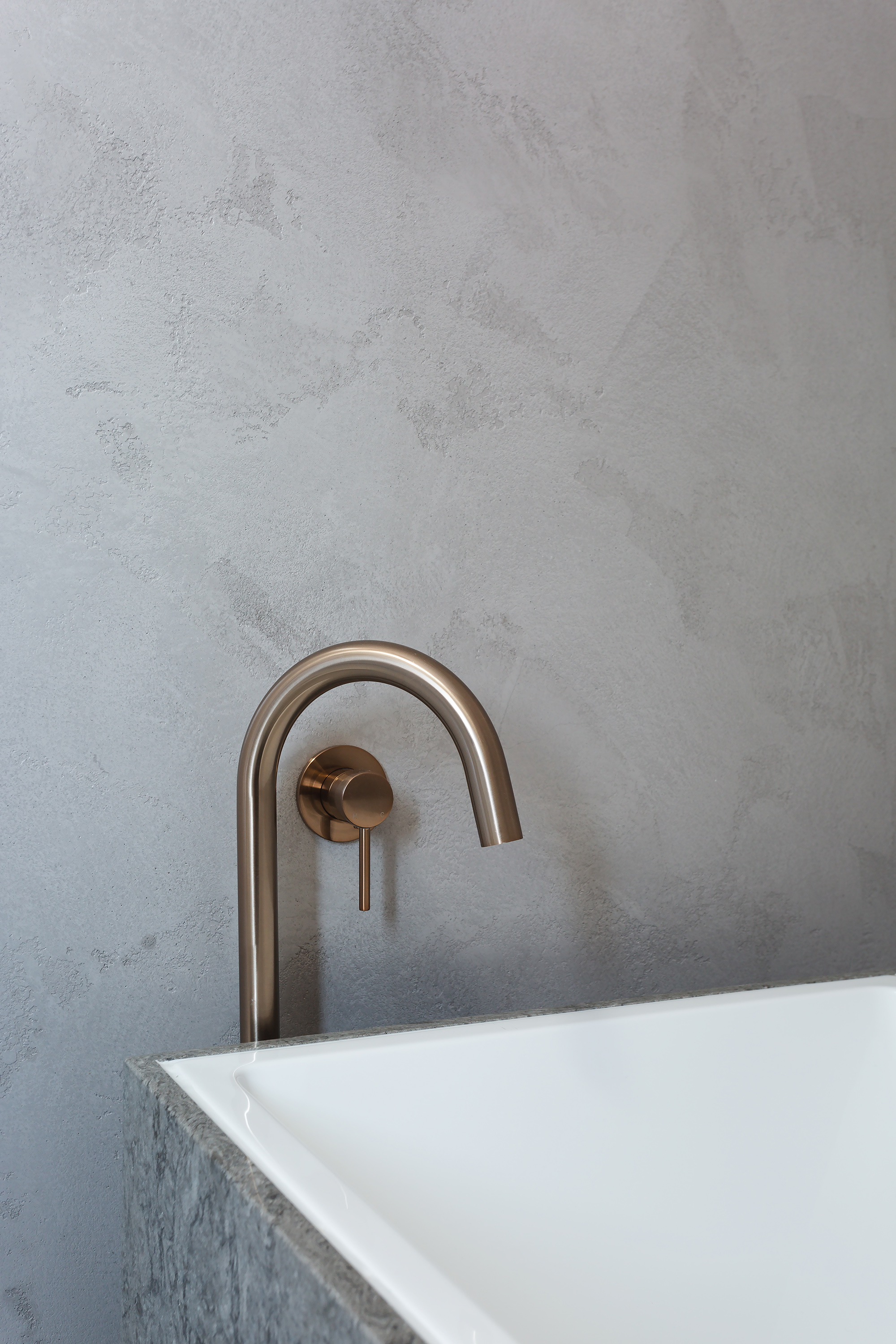
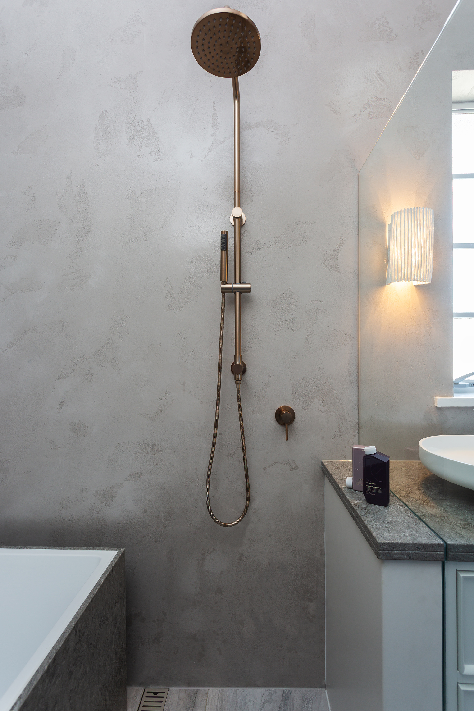
This family in Kew wanted their bathroom to be a beautiful, calming and functional ‘wet area’ for their busy family life.
The combined location of the shower and bath was designed to be multi-functional, allowing the parents to shower and their young children to be supervised in the bath at the same time.
We wanted to create the illusion of increased space in the bathroom, to do this, we specified materials in beautiful soft warm tones - crushed marble wall render instead of tiles, and large format tiles on the floor and stone to disguise the white bath. The result is a cohesive mix of materials and tone, with minimal lines and junctions, allowing the eye to flow easily around the space.
Design challenges included the home’s double brick walls, meaning the client’s desire for a recessed niche could not be achieved. To overcome this, we decided to design the vanity to cut through into the shower, which elongates the bathroom and creates the desired discrete storage shelf in the shower.
Photographer: Courtney King
Henry
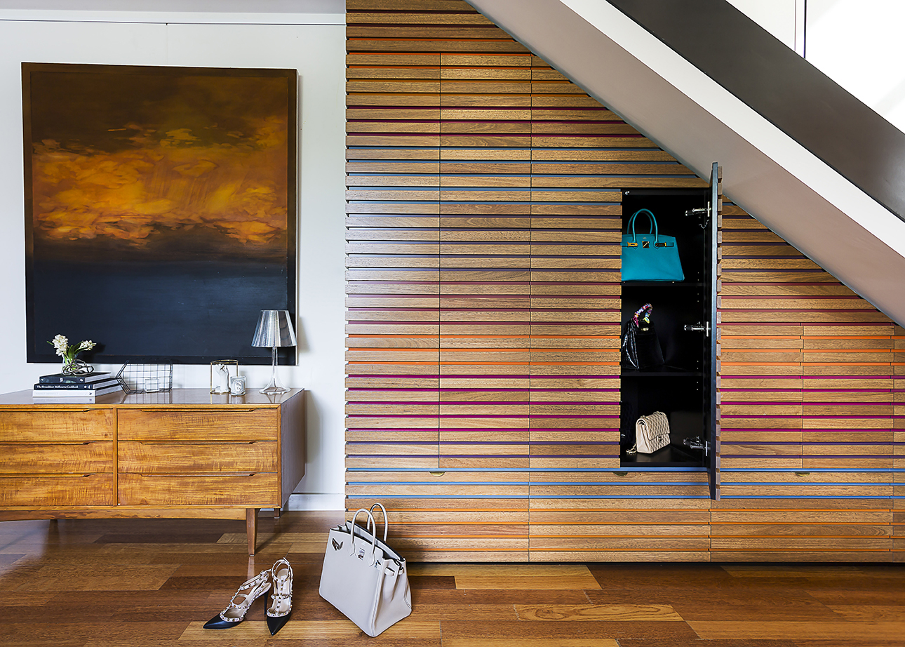
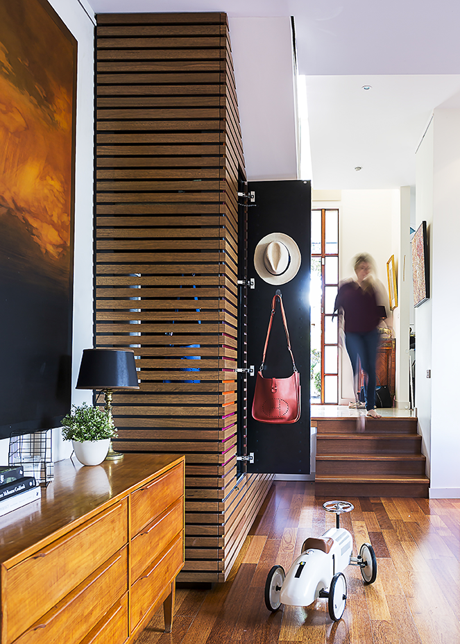
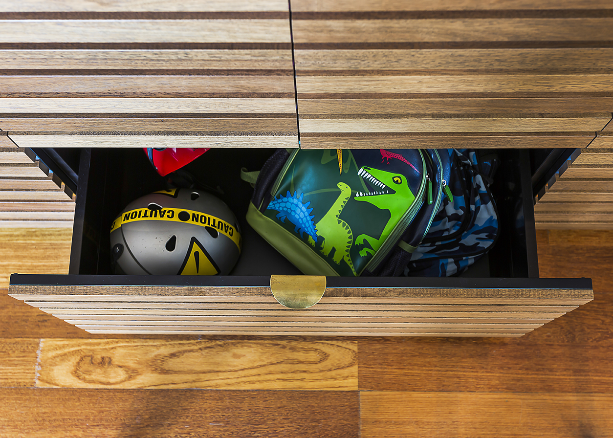
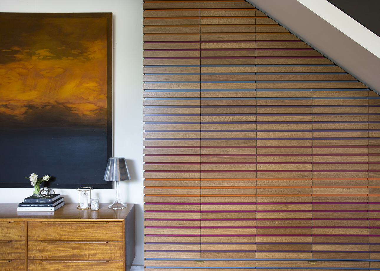
A colourful family in need of a clever storage solution.
The brief was to design something that would not only be practical but also become a feature of the home.
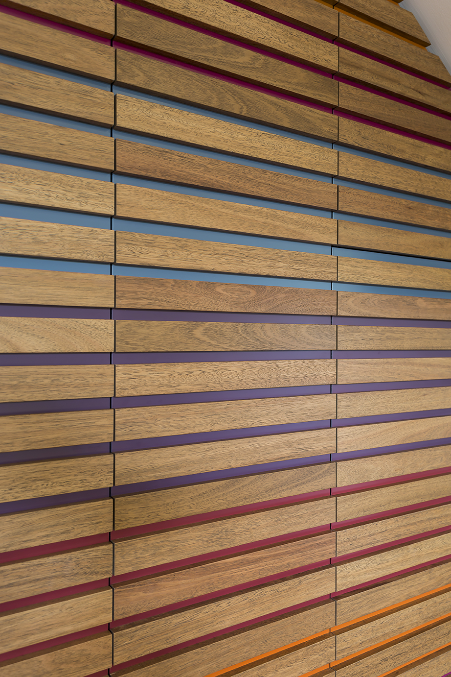
Our solution was to utilise the unusable space under the stairs and create cabinetry that incorporated cupboards and drawers to make this area truly usable. We used slats of black butt timber, similar to the flooring, to wrap the storage unit from top to bottom and utilised the gaps in the wood to bring colour into the unit. This client loved Missoni, so we took inspiration from her incredible wardrobe and brought those colours into her living area.
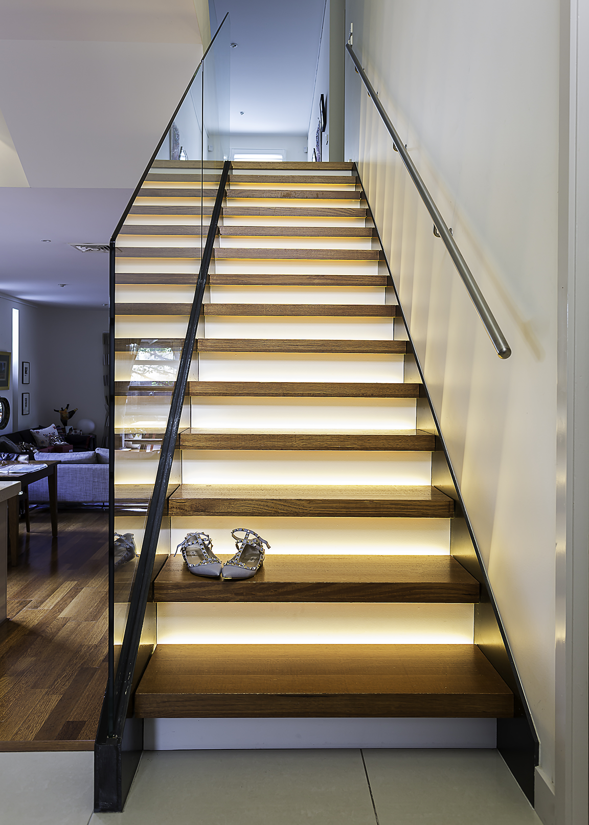
As the staircase above the unit was no longer a floating staircase, we needed to address what could be done to improve the look of the stairs at the entry to the home. Our solution was to block off the underside of each step and install LED lighting at each one. The effect is wonderful and warm, and makes a real statement as you enter this family's home.
This project was shortlisted in the 32nd Annual Dulux Colour Awards 2018.
Photographer: Courtney King
Frank
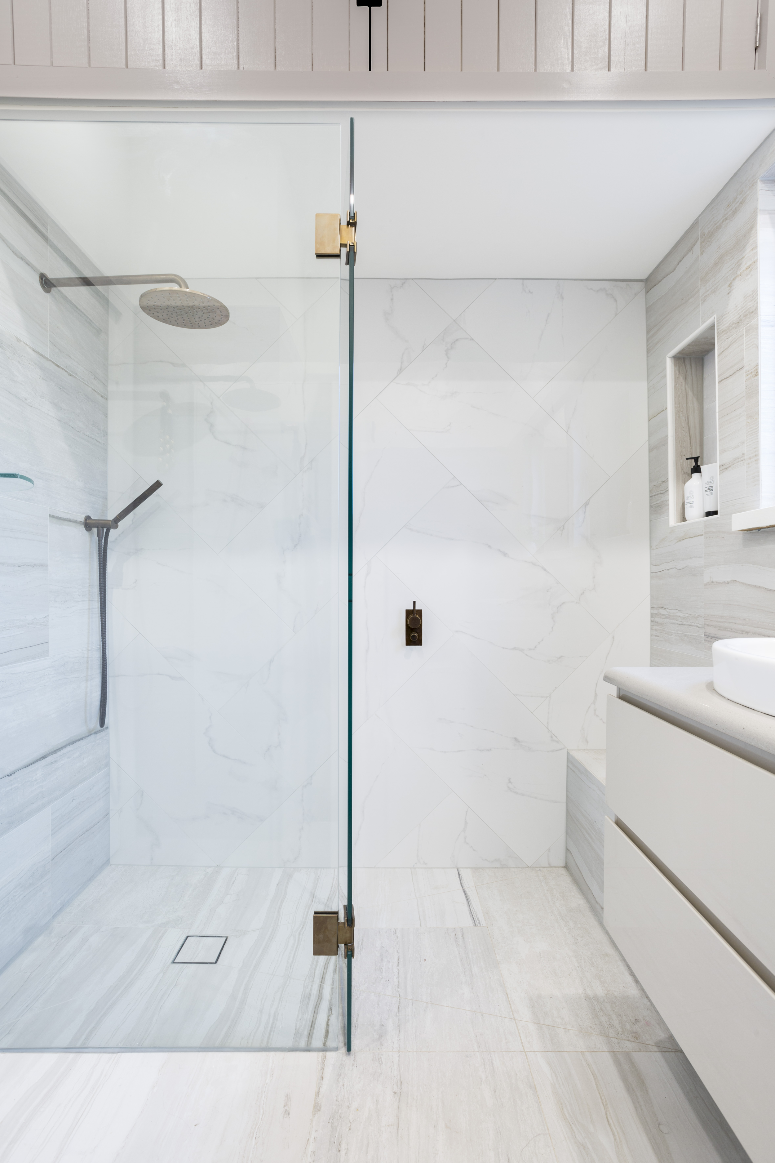
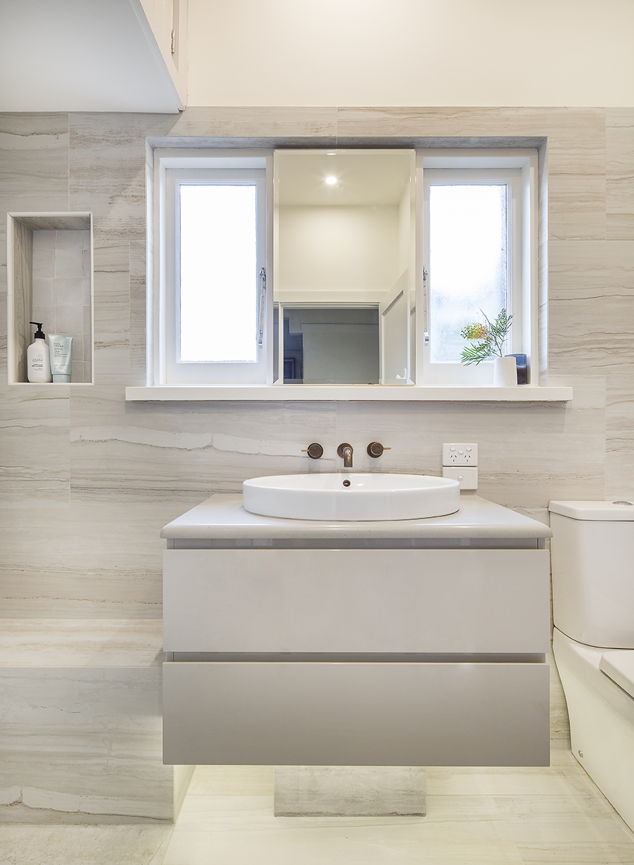
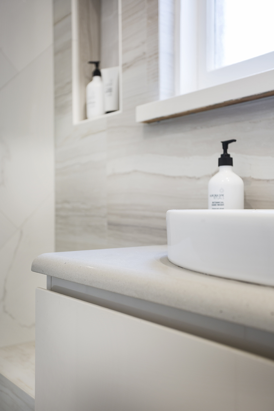
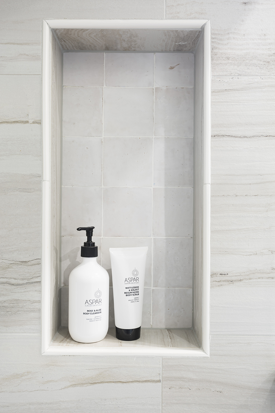
An earthy-toned bathroom for this Elsternwick home.
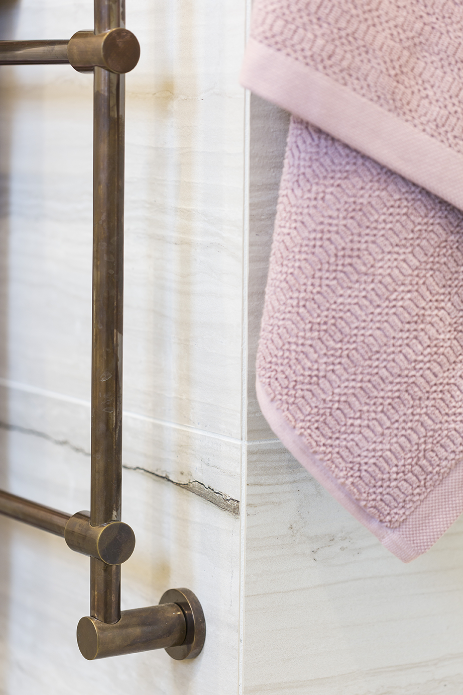
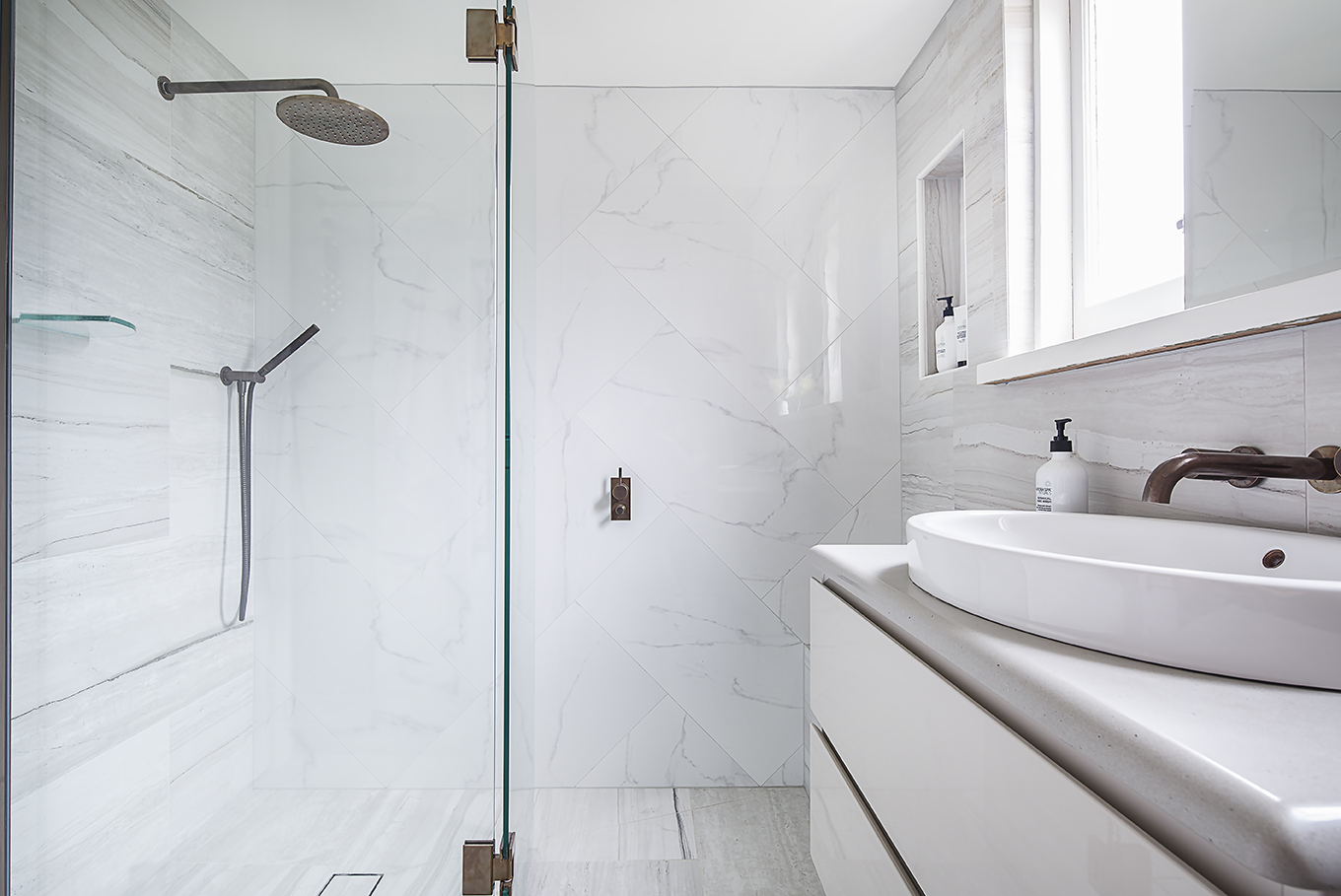
We renovated this bathroom for a female client who desired a light, earthy-toned bathroom that suited her traditional Elsternwick home. We chose fossilised timber and silver travertine look tiles, paired with low contrast Carrara marble to create a modern, yet classic bathroom, that suited the home. Large format tiles were chosen and laid in a herringbone pattern to draw the eye upwards and create visual height in the small space.
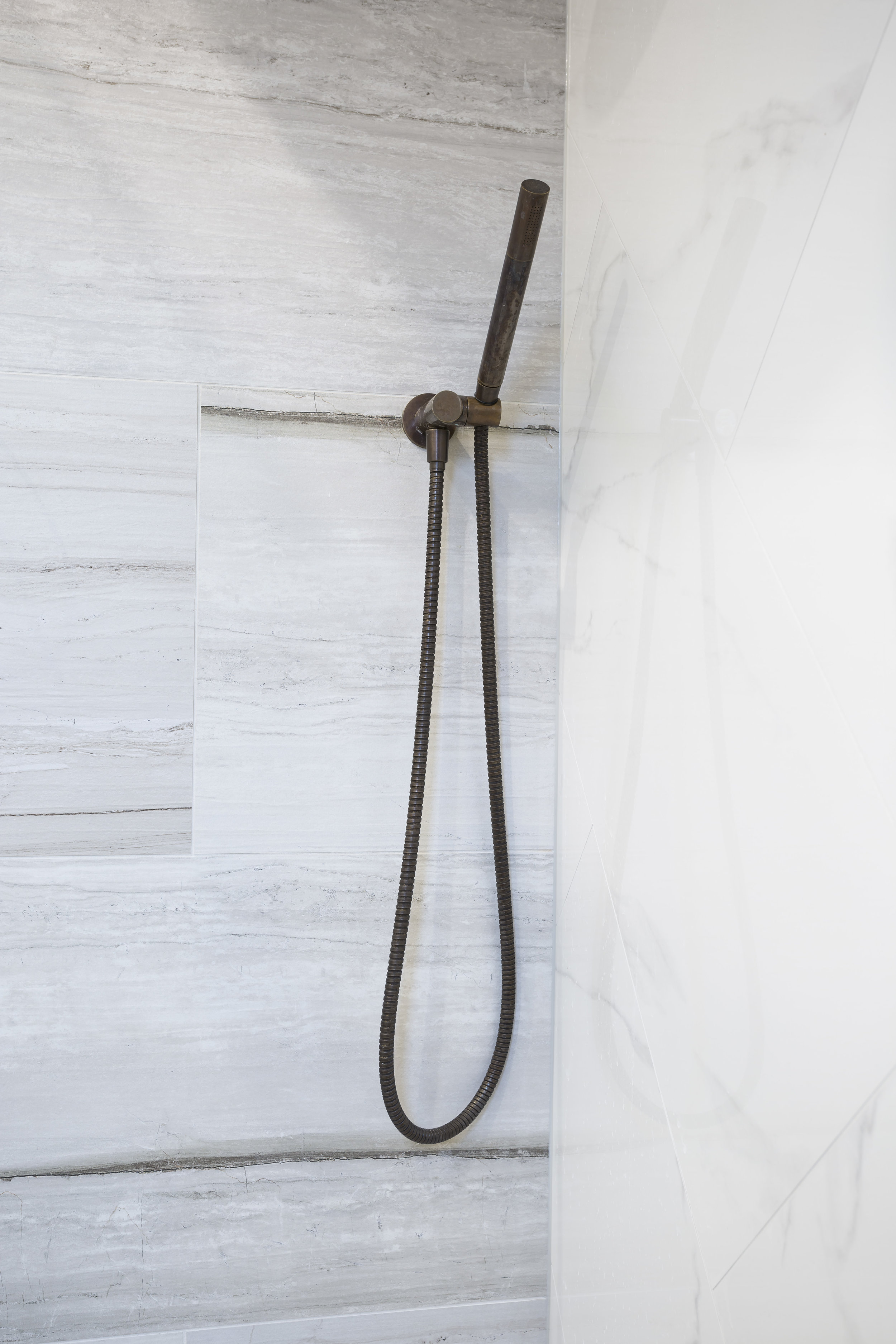
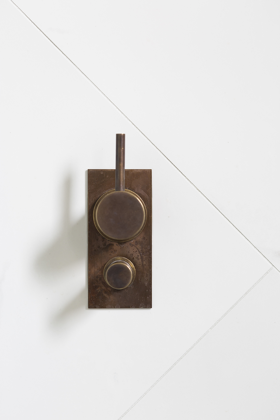
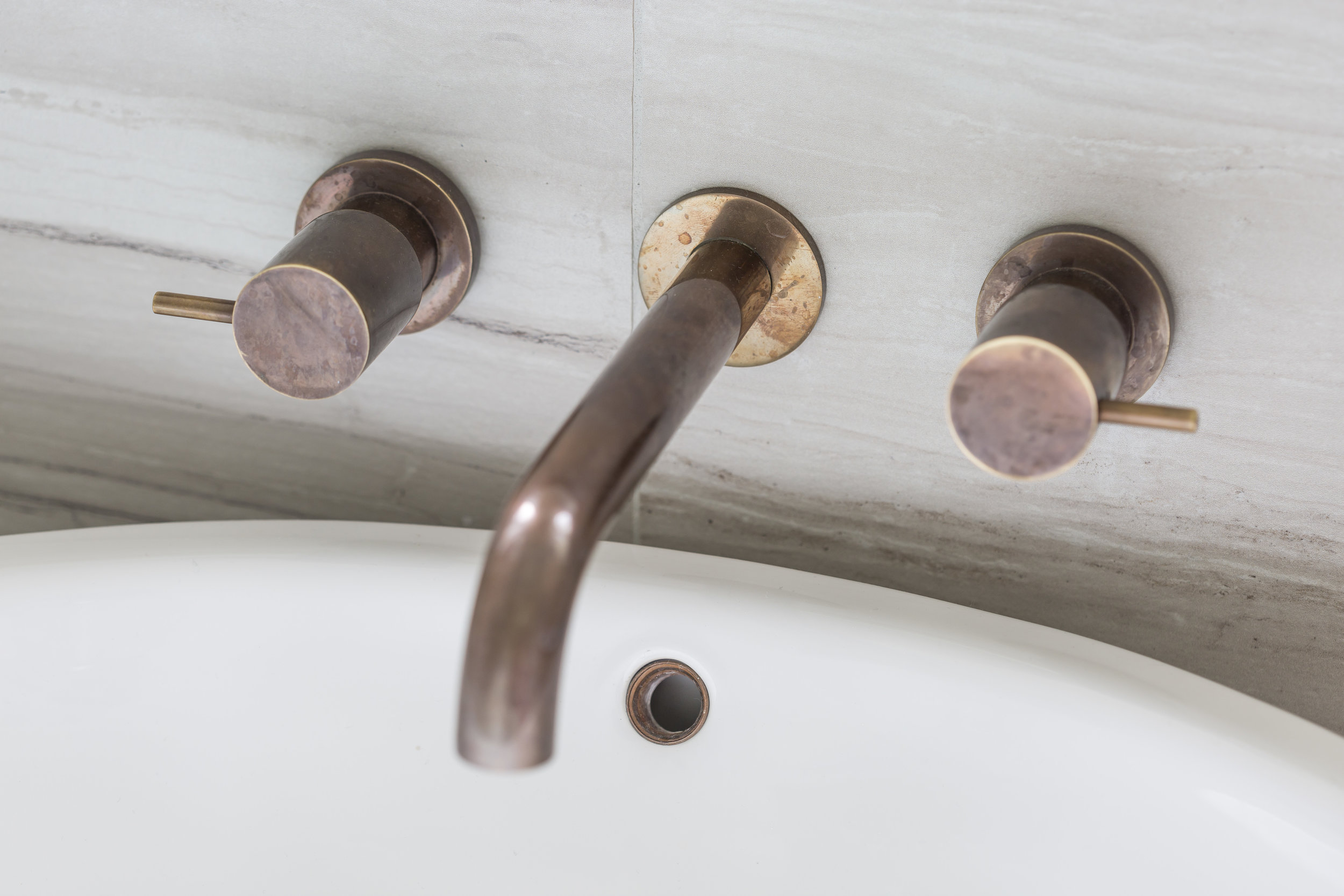
To elevate the earthy tones found in the tiles, we specified beautiful aged bronze tapware that was hand-dipped in New Zealand. Using this unique finish allowed us to meet the colour brief and also create a sense of luxury in the space.
Photographer: Courtney King